

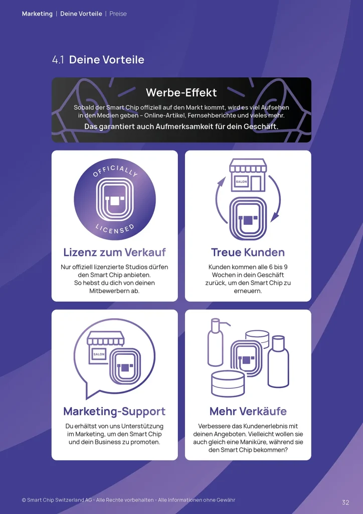
Typography
Typography is key to the Smart Chip brand, shaping how people see and understand our message. With a flexible and evolving visual style, consistent use of our typeface ensures clarity and reinforces recognition.
Typeface
Good legibility and versatility are the top priorities in the font selection. Our house font is Manrope, both in print and on digital devices.
Manrope Regular
Manrope Bold
Manrope ExtraBold
Headlines & Supporting Text
We distinguish between two areas of application for our typographic rules: Headlines and Supporting text.
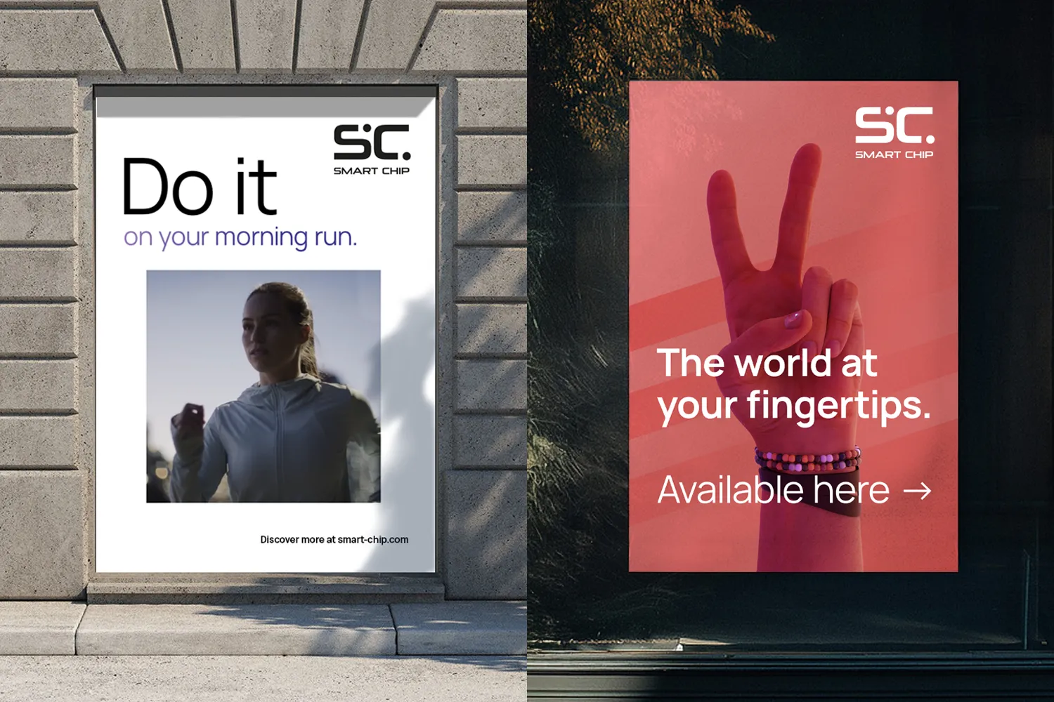
Headlines are the big titles on posters, billboards, banners, and more. They’re meant to grab attention and make people stop, look, and remember.
Supporting text is everything beyond the headline. Once the headline grabs attention, the supporting text delivers the details.
Headlines
Headlines are designed to be flexible. Their size isn’t set in stone and instead depends on the grid layout, the size of the container and more. You will learn more about them in the section about Layouts.
Font Weight
Headlines are typically set in Manrope Regular.
When overlaying a headline over imagery you can use Manrope Bold or ExtraBold for more contrast.
Color
You can highlight a part of the headline in a gradient from the color palette. It can be a whole sentence or just single words, but never the whole headline. Use the color to emphasize a point.
Choose a gradient color that complements the imagery. It can either reflect a dominant color in the picture, pick up a striking detail or just fit the vibe.
When placing the headline on imagery, look for the highest contrast and readability.
Don’t force color in the text – if the background is busy, the whole text should be black or white to be as clear and readable as possible. Only use colored text if it is placed on a background that is calm enough.


Leading & Tracking
The leading for headlines is typically equal to their size. A headline with a size of 50 pt has a leading of 50 pt, for example.
We leave tracking at 0%.
Supporting Text
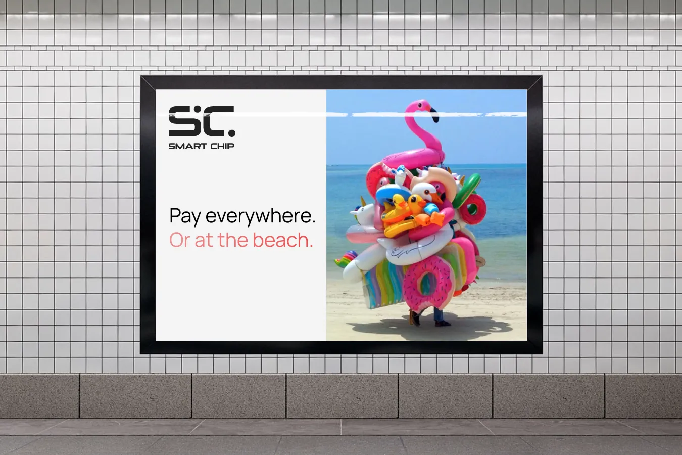
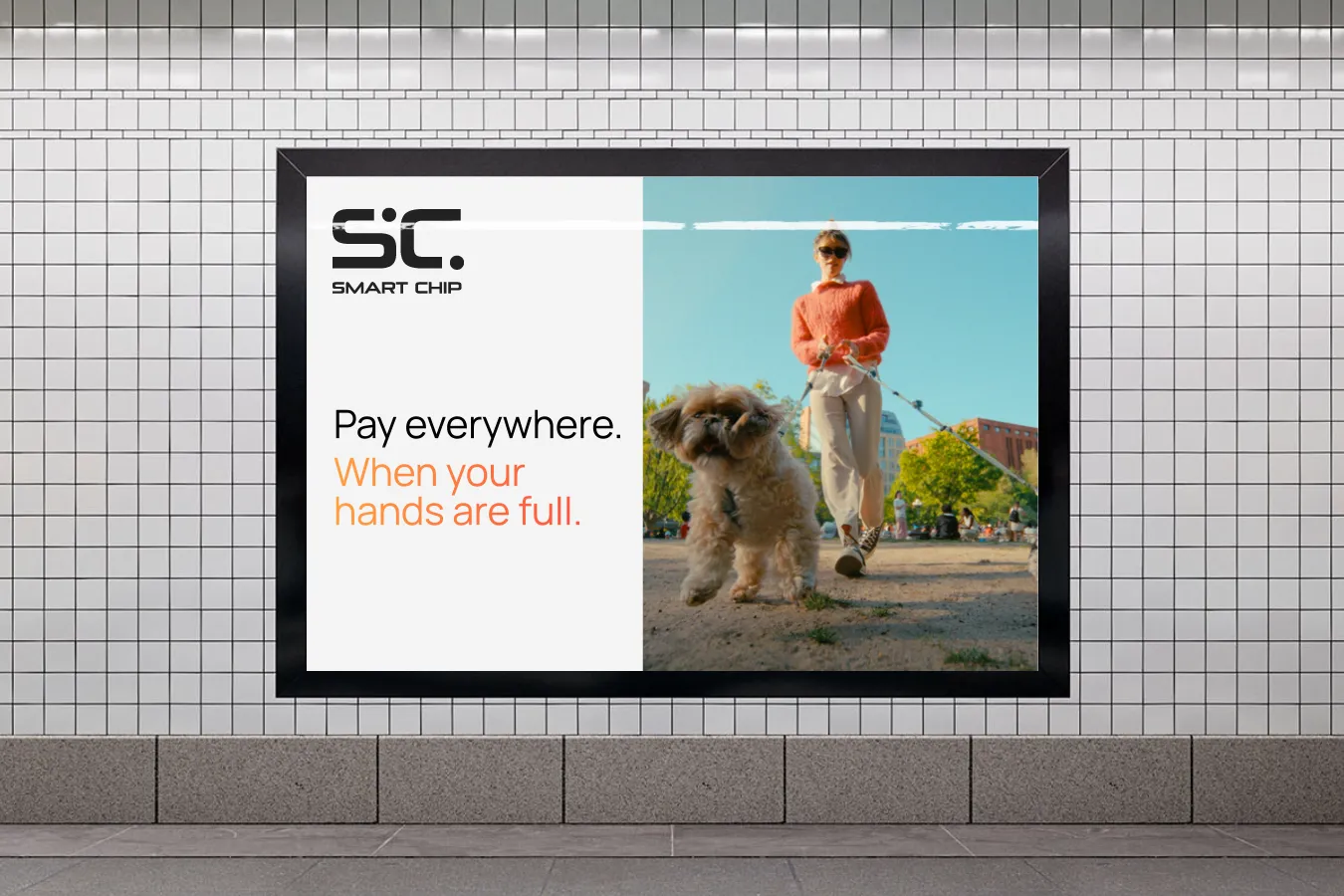
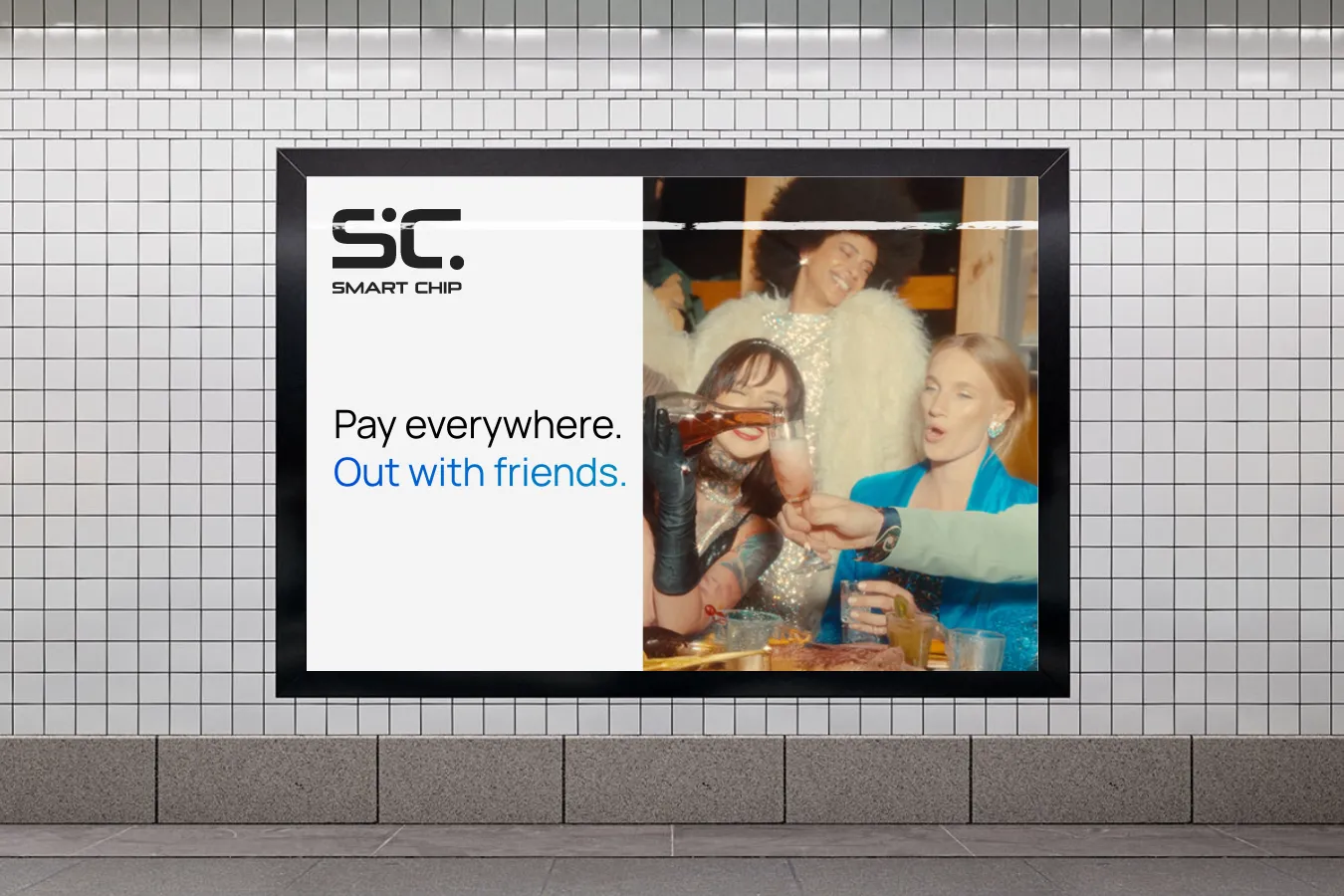
Supporting text is all text besides headlines – copy lines, CTA’s, and more. As the name implies, it’s there to support the headline. It’s not made to draw attention – that’s the headline’s job. Instead, it is designed to convey additional information as clearly as possible.
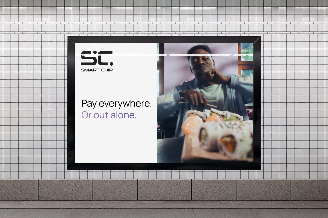
Paragraph Styles
There are four paragraph styles for supporting text. They are designed to ensure maximum readability, a clear hierarchy, and to make the content as easy to read as possible.
Supporting text is always left aligned.
Main titles are the big, attention-grabbing titles. They are short (typically no more than five words) and there should be only one per page.
Main titles use Manrope Bold or Extra Bold.
Subtitles are used to organise content into sections, making it easier to navigate the information. You can also use them to highlight key points or to draw attention to important information.
Subtitles always use Manrope Bold.
Body text is the standard style for text.
Body text uses Manrope Regular, but other font weights are permitted to highlight parts of the text, to emphasize a point and to make the information as clear as possible.
Small print is footers, disclaimers and everything else that needs to be present but doesn’t need to be in the foreground.
Like body text, all font weights are permitted, with Manrope Regular being the standard.
Sizes
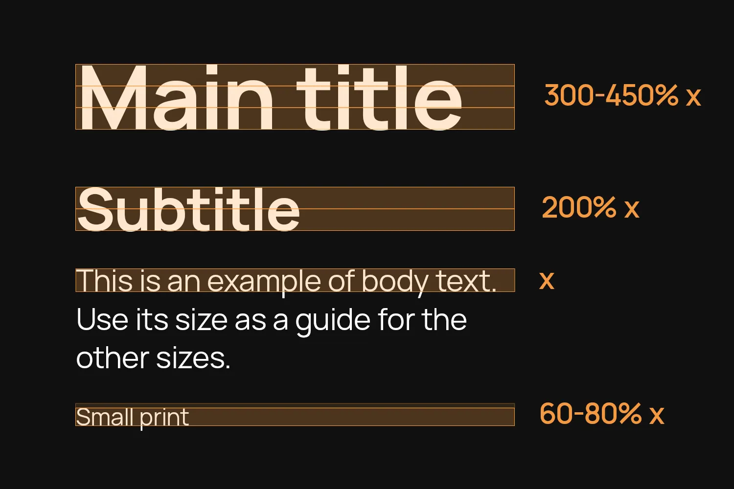
Use the size of the body text as a guide for the other sizes. The default body text size is 10pt (print) or 18px/1.12rem (screen).
Subtitles are twice as big. That means a default of 20pt (print) or 36px/2.24rem (screen).
Main titles are between 3 to 4.5 times as big, meaning 30 to 45pt (print) or 54 to 81px/3.36 to 5.3rem (screen). Choose a size that best fits your amount of text.
Small print is 0.6 to 0.8 times as big.
Leading & Tracking
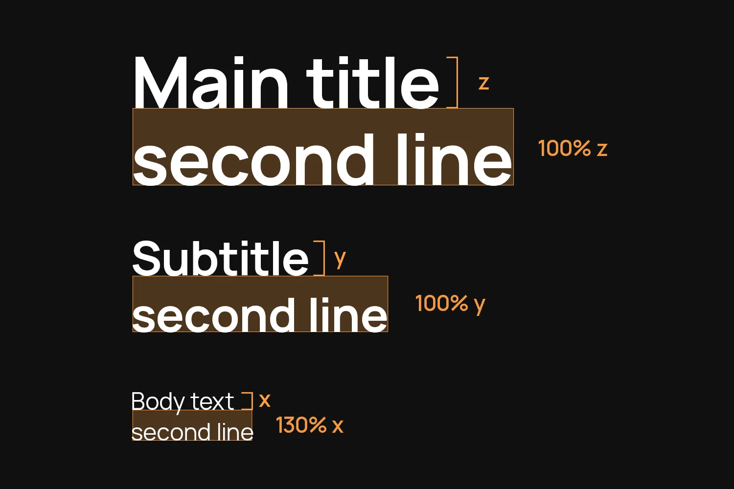
Main titles and Subtitles use a leading of 100%.
Body text gets a bit more breathing room with a leading of 130%.
Tracking is always 0%.
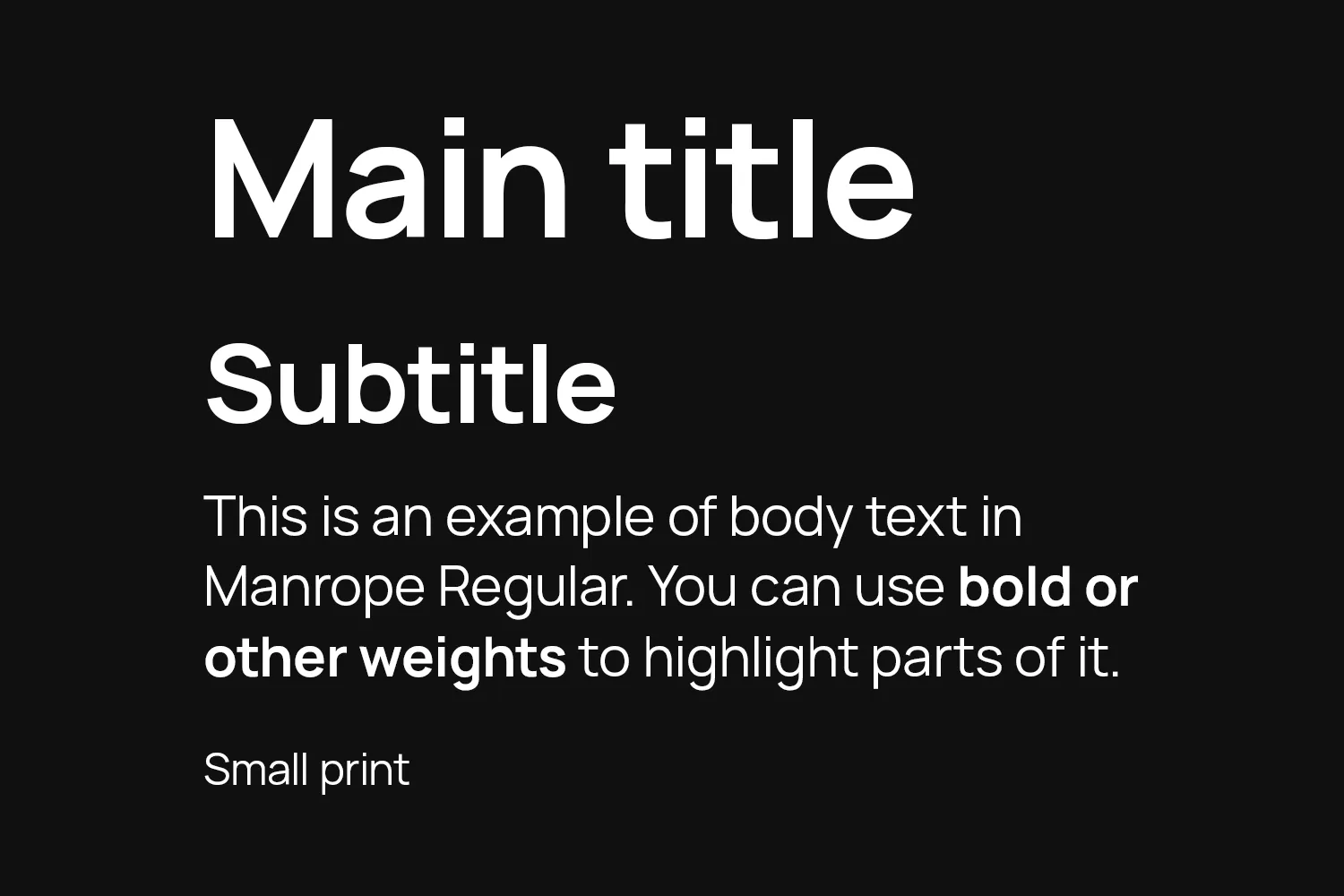
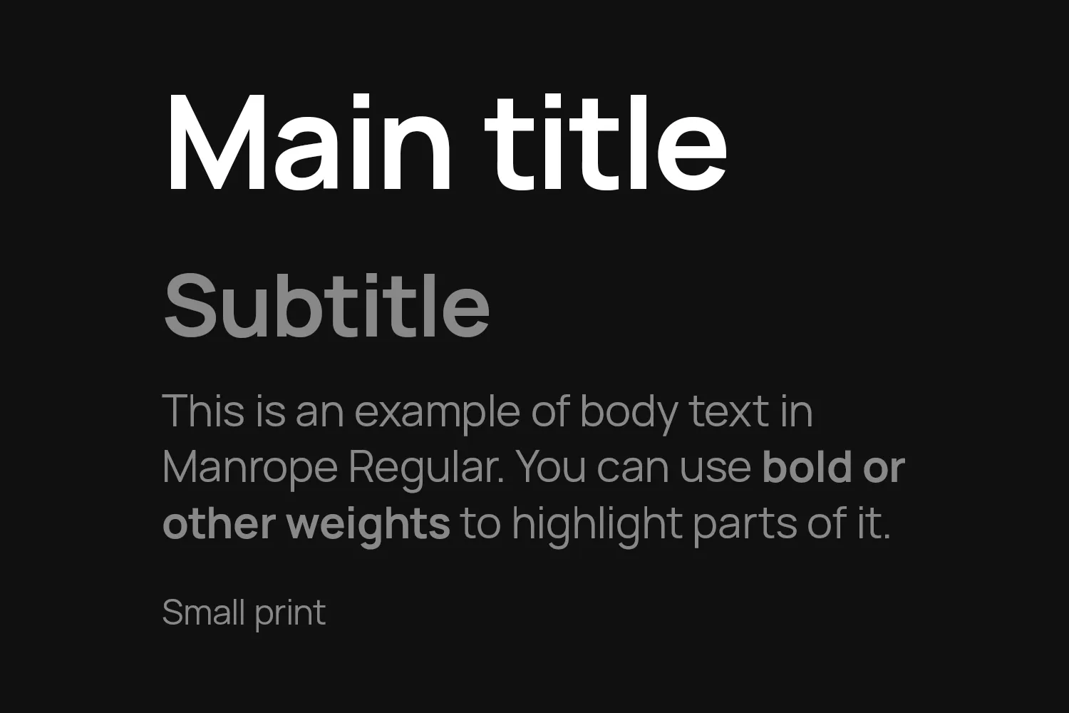
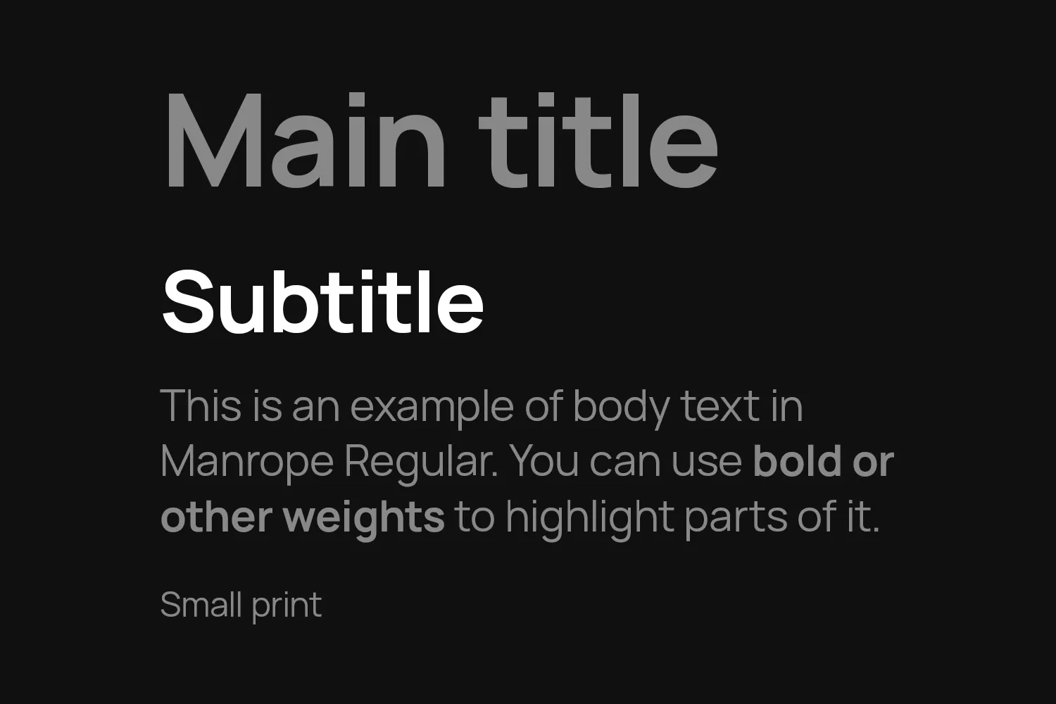
Color
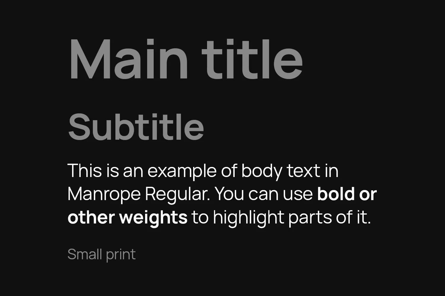
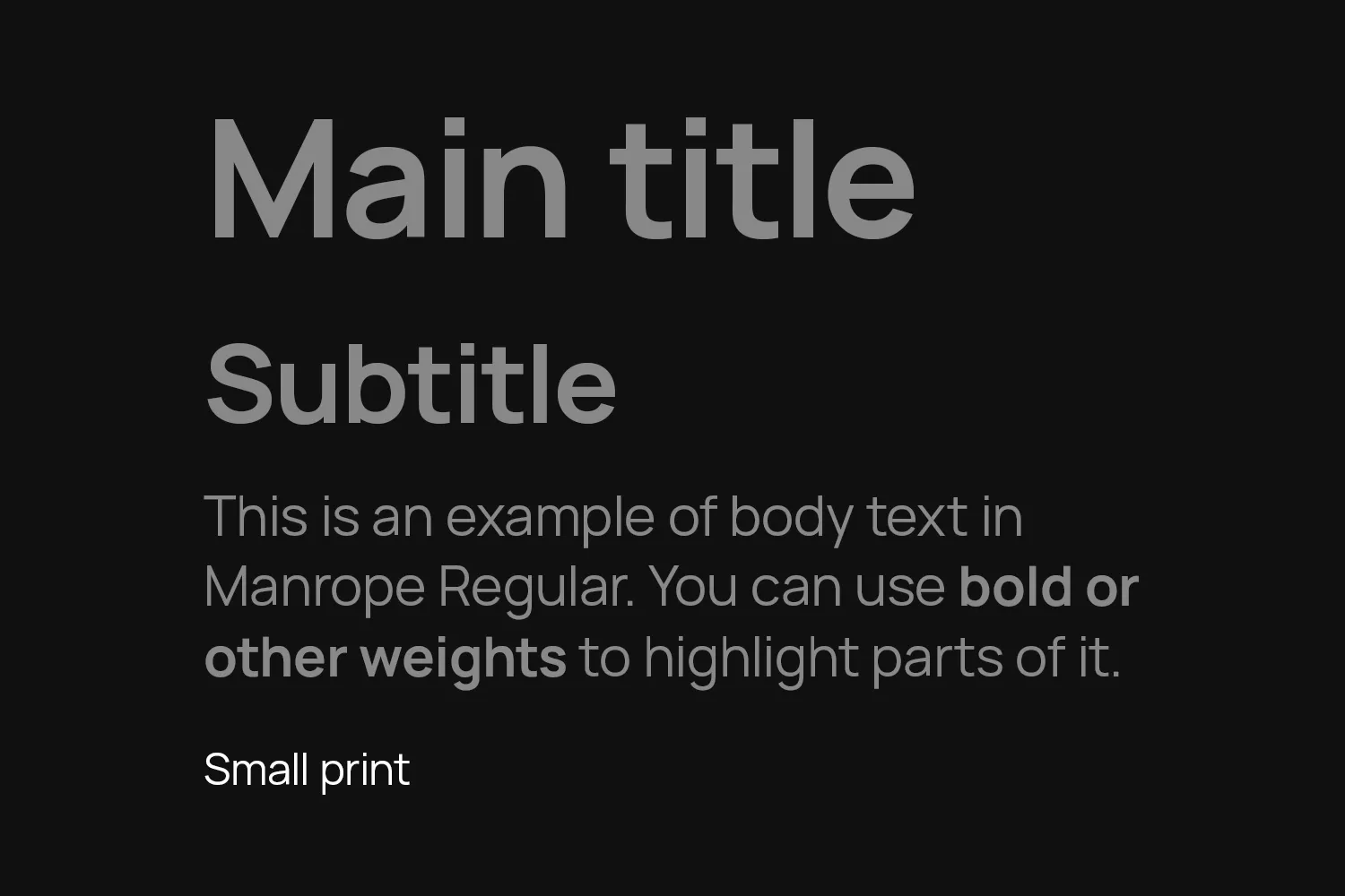
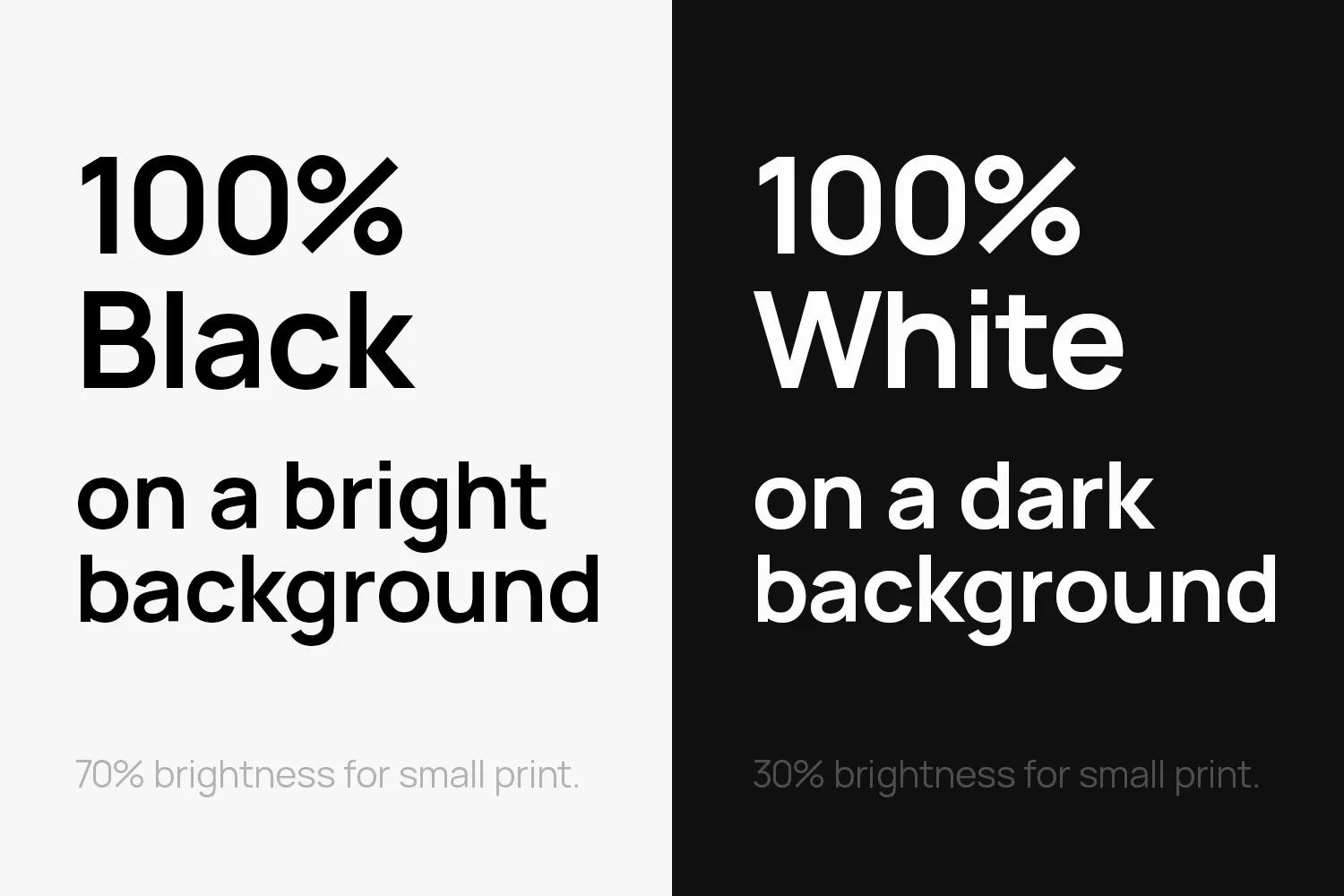
Titles, subtitles and body text are either 100% black or white, depending on the background color.
Small print is set in 70% brightness on bright backgrounds or 30% brightness on dark ones.
Like with headlines, you can set main titles and subtitles in a color from the color palette. You can color the whole title or single words.
Line Breaks
Use line breaks to break up main titles and subtitles. This makes them more compact and gives the whole text more room to breathe.
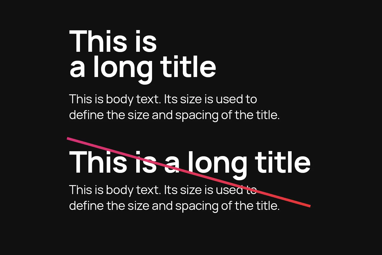
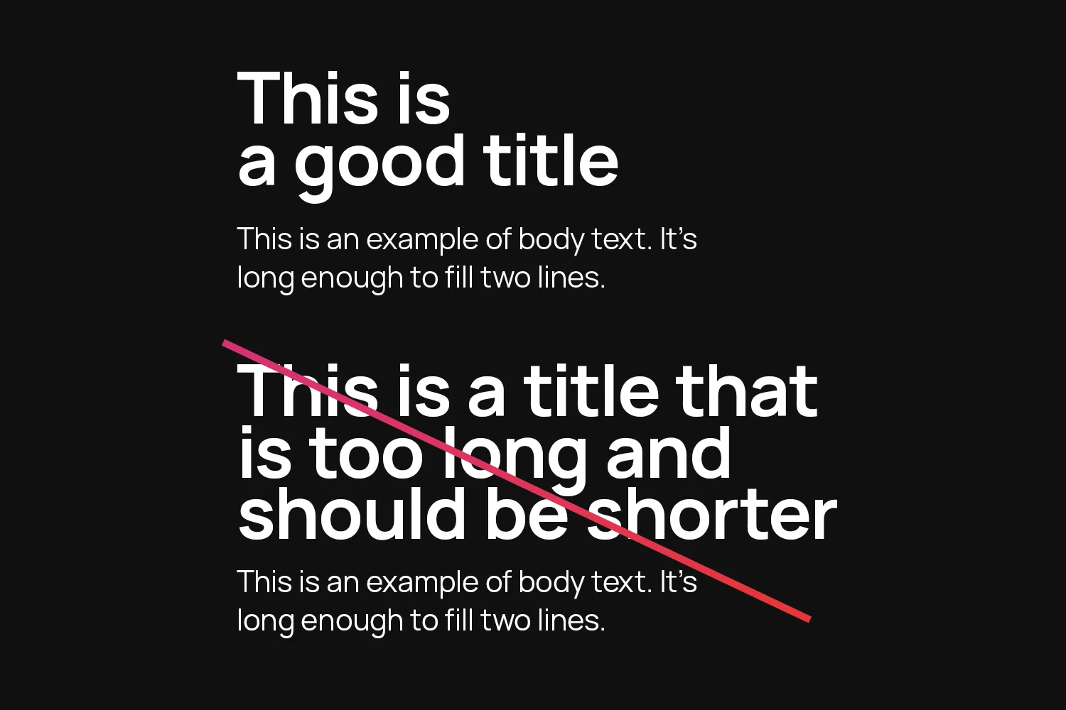
Title Length
Keep main titles short. They should be concise and grab the attention with just a few words, typically no more than five. If your title is longer than that, it should probably be a subtitle instead.
On a typical page, there is only one main title.
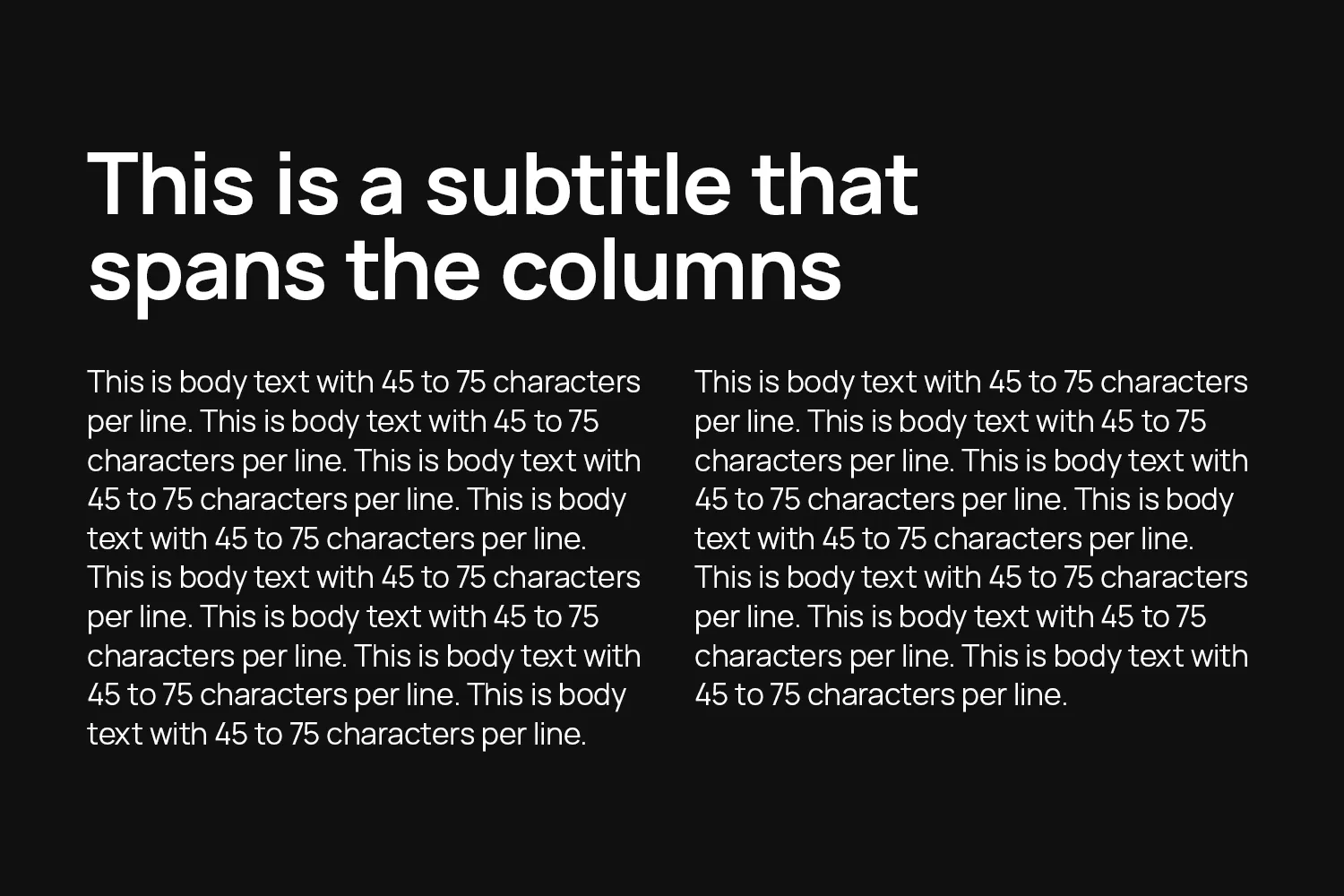
Line Lengths
Break up long body text into two columns, but not more. This keeps the line lengths manageable. Aim for 45 to 75 characters (including spaces and punctuation) per line.
Main titles and subtitles always span the columns.
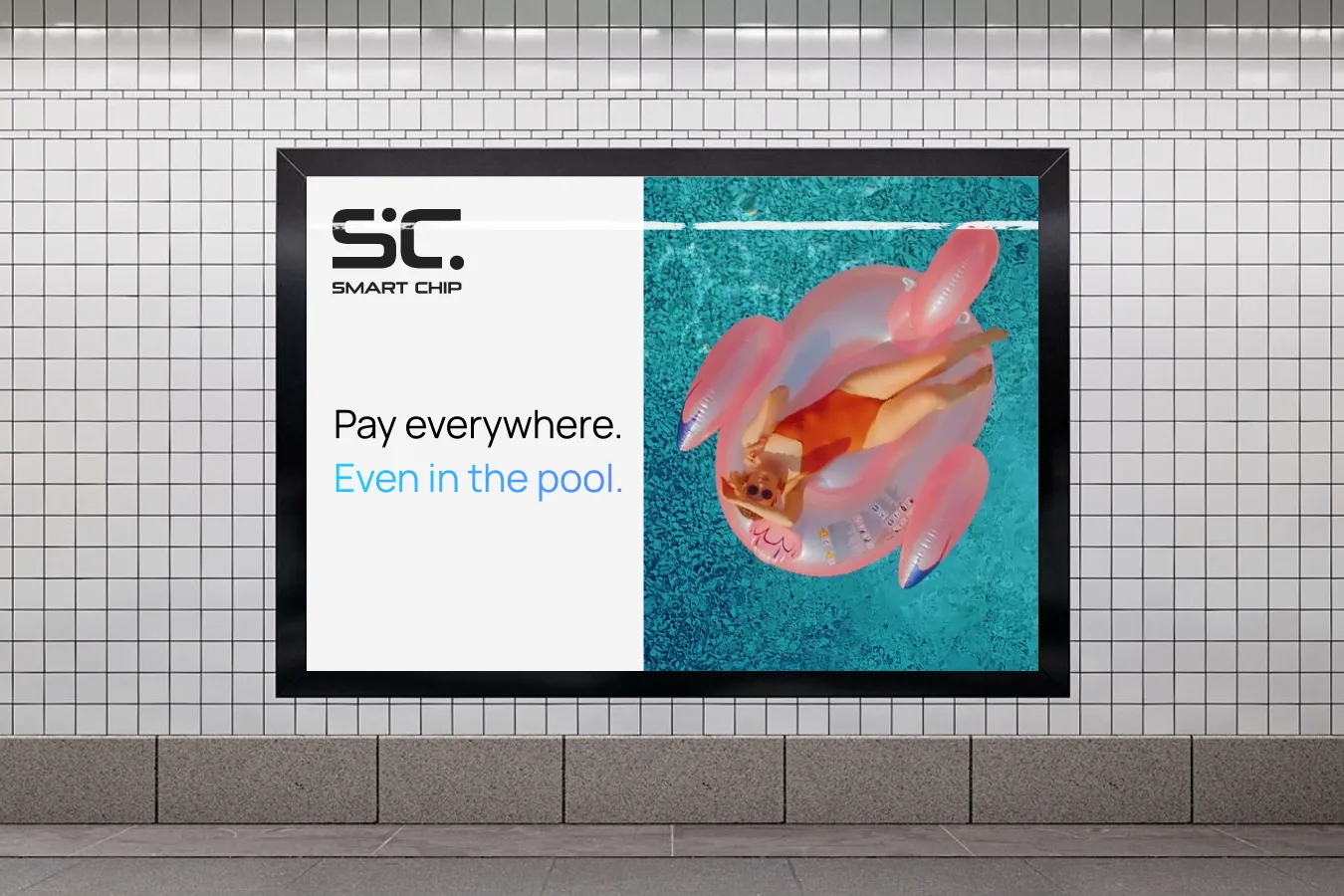
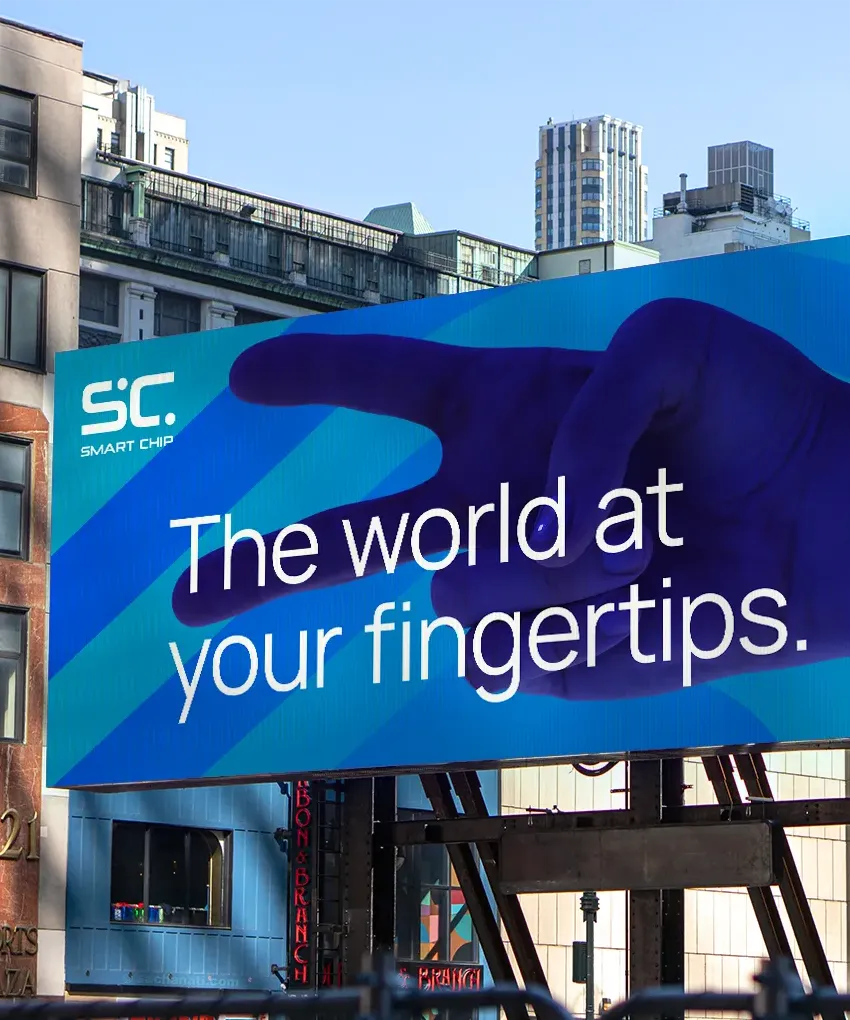
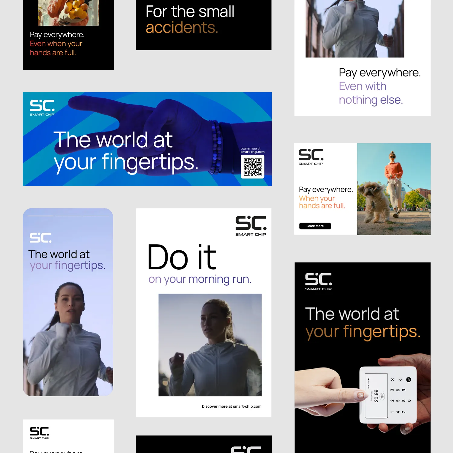
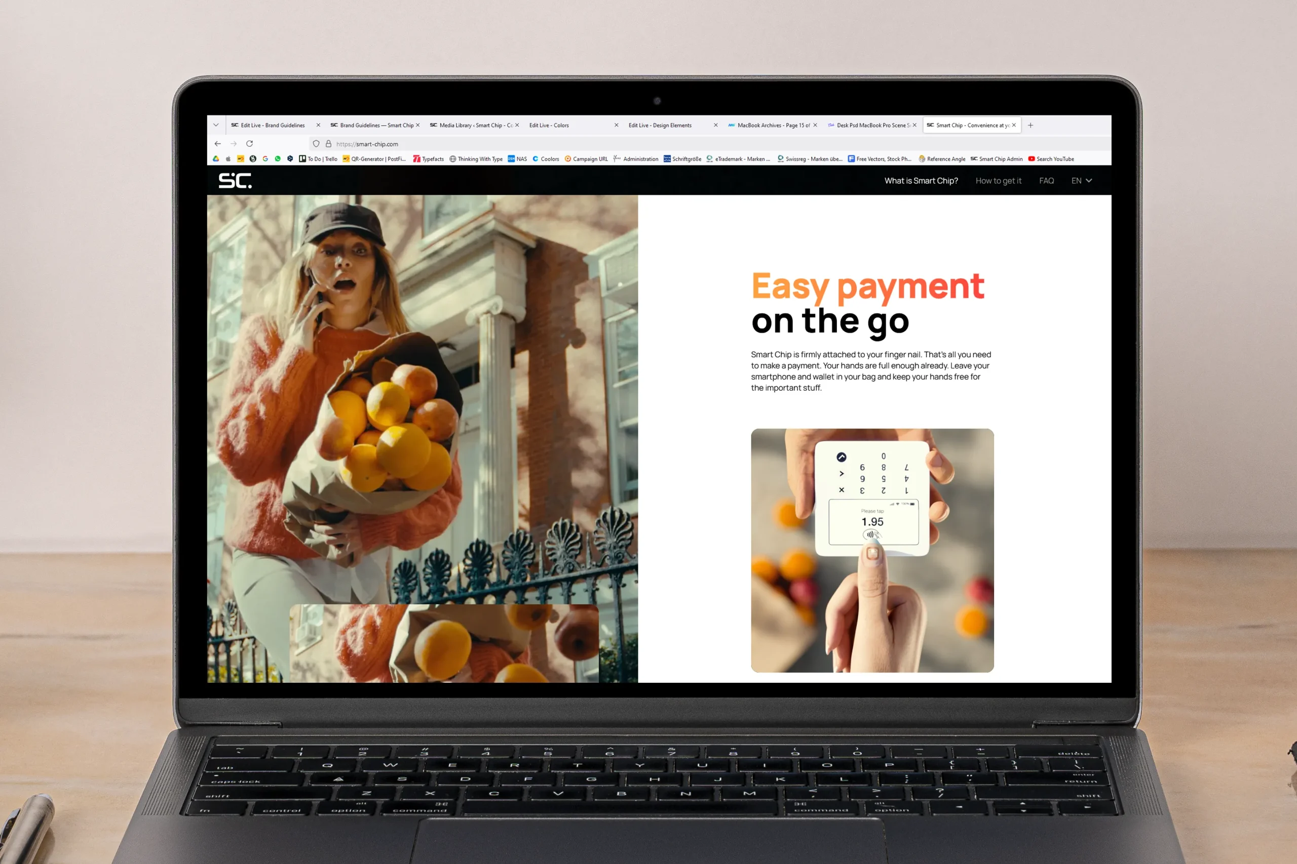
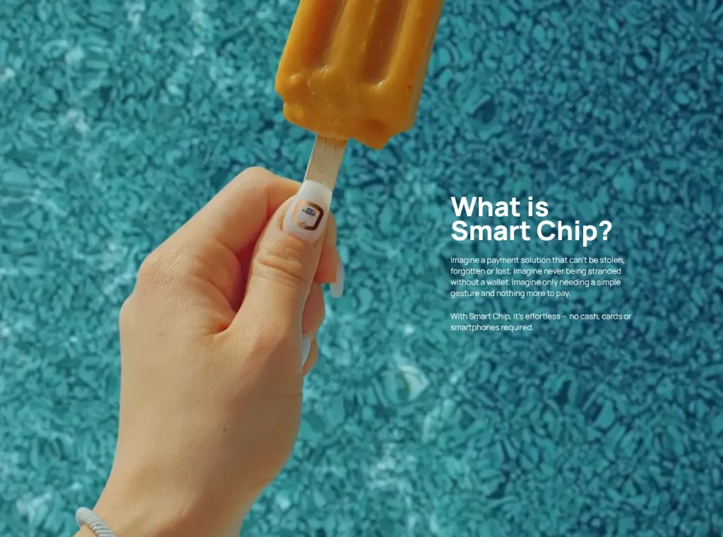
Examples
These are some examples of how to use supporting text and how to combine it with imagery and graphical elements.
For examples on headlines, refer to the section on Layouts.
Don’ts
Please avoid the following mistakes.
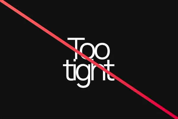
Don’t make letter spacing too tight.
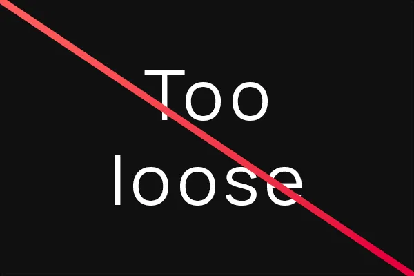
Don’t make letter spacing too loose.
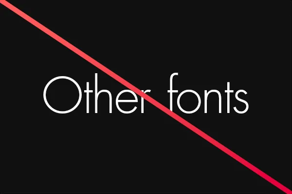
Don’t use other fonts.
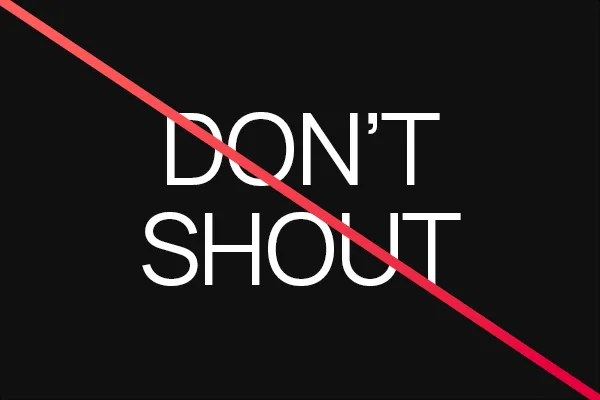
Don’t use all caps.
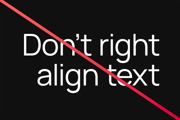
Don’t right-align text.

Don’t add effects like drop shadows or outlines.