

Colors
Smart Chip’s color palette reflects its fun and dynamic personality. Our main colors – black and white – create a bold and timeless foundation. Highlight colors add flexibility and vibrancy, helping us adapt to different moods and contexts while keeping everything fresh and cohesive.
Primary Colors
The color palette is Black and White combined with a Highlight Color. Black and White are simple and ensure the greatest possible contrast and readability. The different highlight colors, displayed as a linear gradient, add a splash of energy and reflect the playful ways Smart Chip makes life easier.
Black
CMYK (Rich Black)
60/40/40/100
Hex
#000000
White
CMYK
0/0/0/0
Hex
#ffffff
Highlight Colors
The highlight colors support and expand the primary colors. They’re a core part of our dynamic visual identity. We use them to give designs variety and breathe life into our visual language.
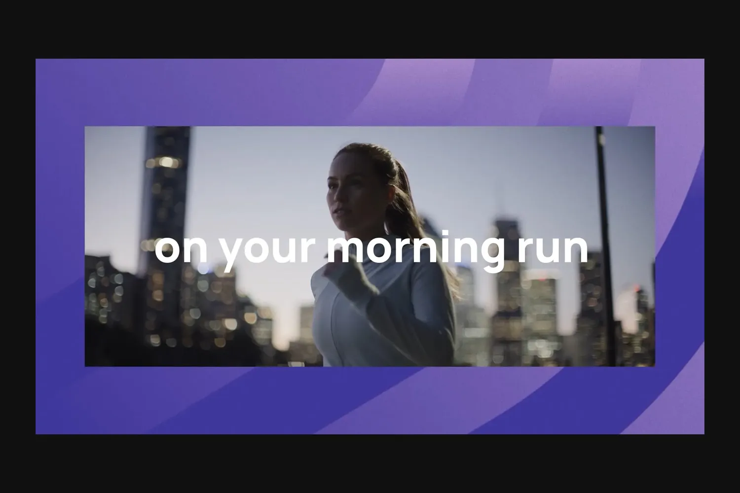
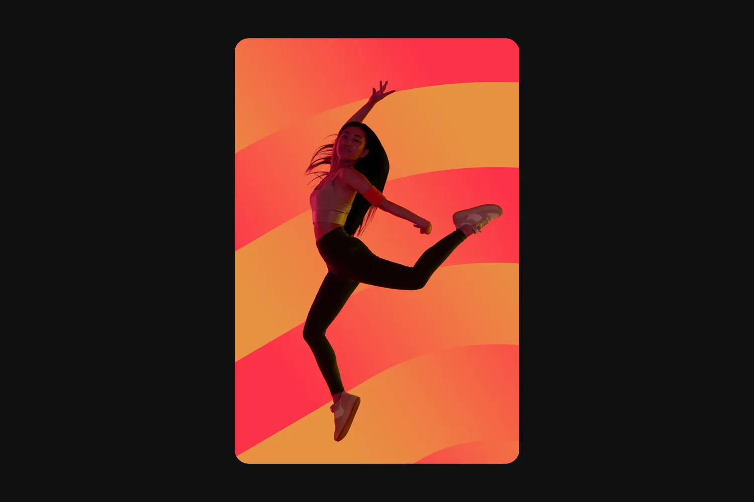
Consider the mood or tone of your design when choosing a color. Each gradient conveys a different feeling. For example, Cool Purple is a calm color, making it ideal for more relaxed topics. On the other hand, Vibrant Orange is active and energetic, perfect for dynamic or action-oriented content. Think about the message you want to communicate and select the color that best supports that narrative.
There is one very important rule: Do not use more than one color in the same layout. Each highlight color should stand on its own.
Vibrant Orange
CMYK
0/46/78/0 > 0/86/70/0
Hex
#ffa041 > #fc3a3c
Deep Blue
CMYK
79/24/6/2 > 90/69/0/0
Hex
#0393bc > #004cd5
Cool Purple
CMYK
47/59/0/0 > 80/82/0/0
Hex
#9d77c4 > #554195
Copper
CMYK
0/46/78/0 > 24/58/86/15
Hex
#ffa041 > #b26e31
Electric Blue
CMYK
65/0/0/0 > 70/54/0/0
Hex
#23c8fe > #647cff
Warm Purple
CMYK
40/72/0/0 > 68/74/0/0
Hex
#a85fa2 > #6e539e
Pretty Pink
CMYK
5/54/34/0 > 0/85/69/0
Hex
#ea9091 > #ed4343
Calm Green
CMYK
62/0/92/0 > 86/29/88/16
Hex
#71b541 > #197642
Alert Red
CMYK
0/76/55/0 > 0/100/68/0
Hex
#ff5a5a > #e6003c
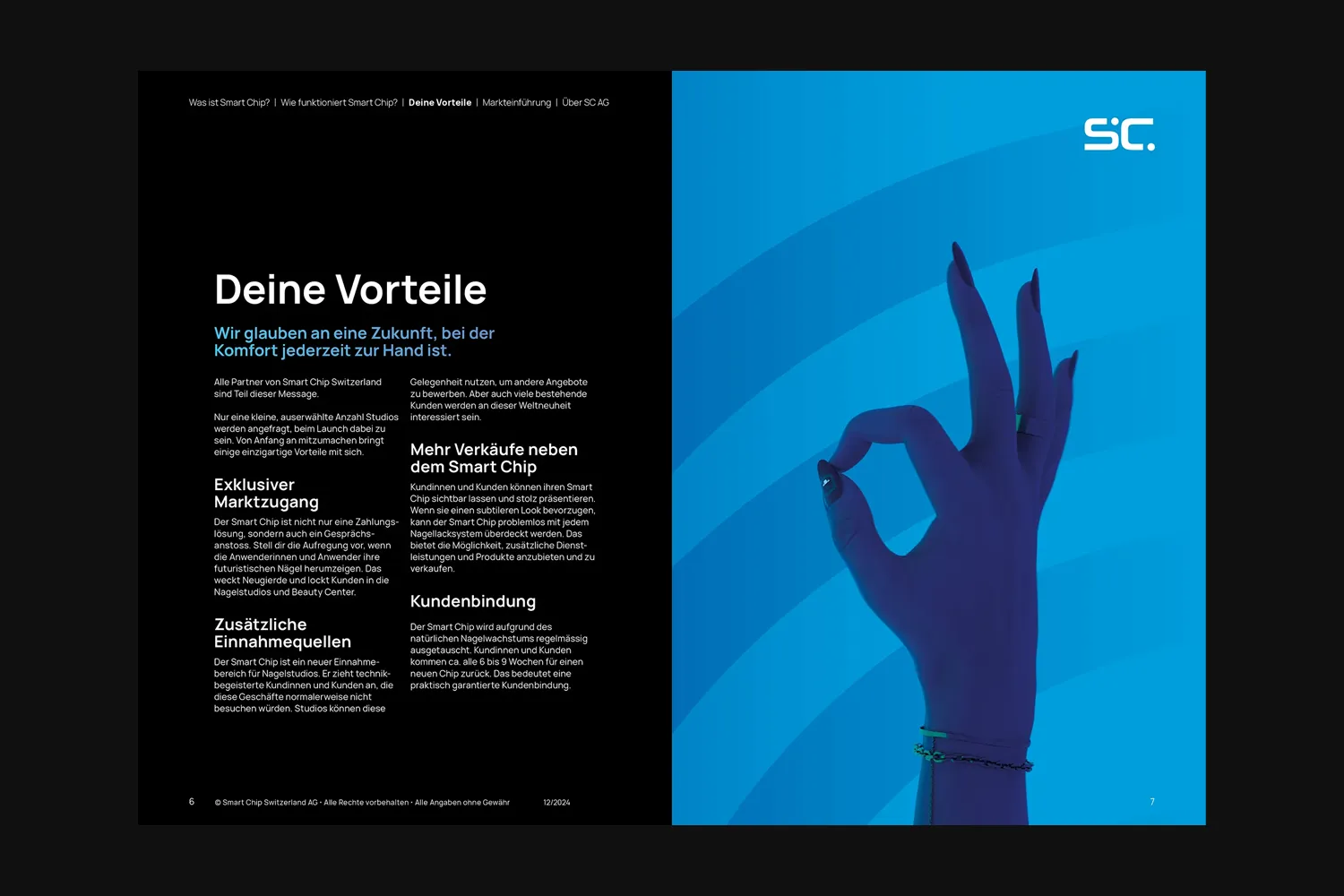
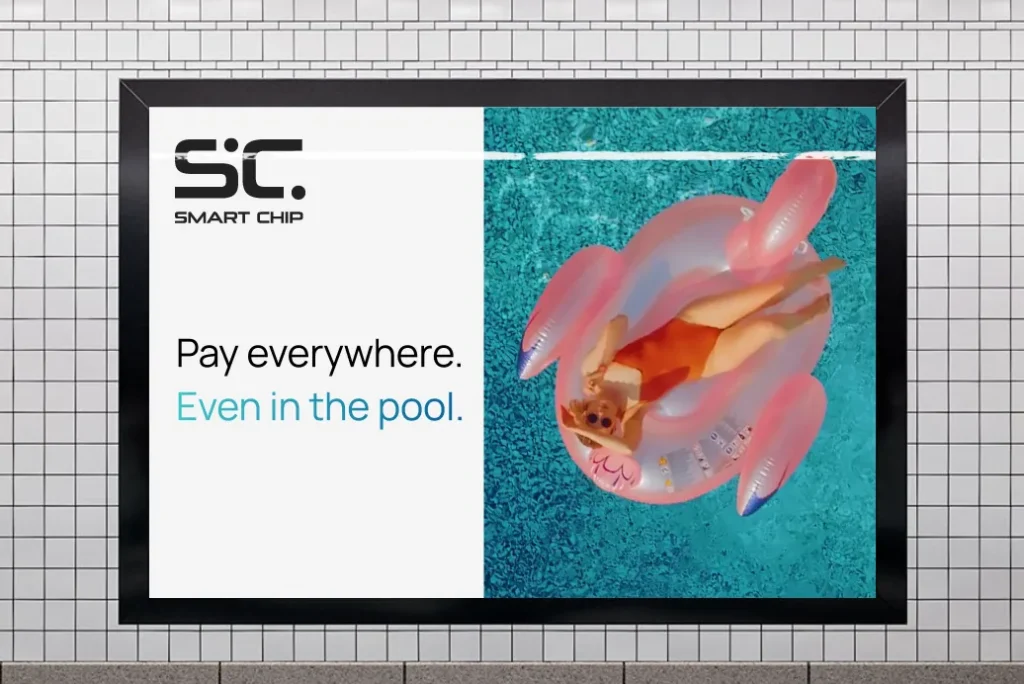
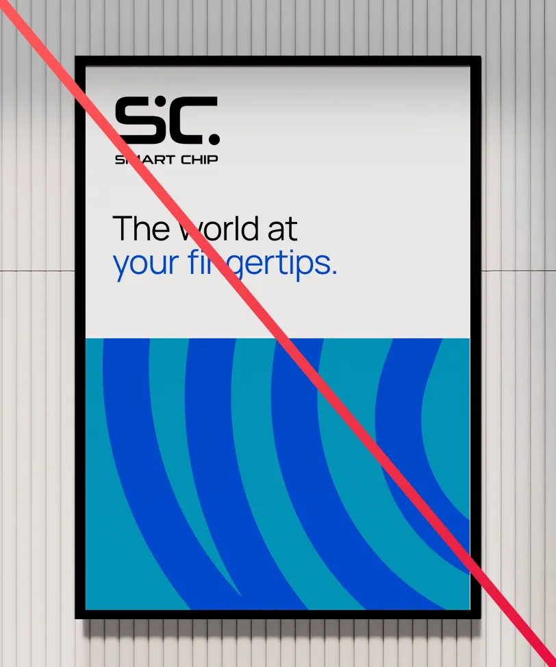
Gradients & Curves
Wherever possible, we use gradients for our highlight colors, combined with a central design element called the Curves. Here you learn how to make and use them.
Curves
The curves are mainly used for backgrounds. They give them more visual interest, depth and a sense of movement.

The curves are made by scaling, rotating and cropping the chip icon. The scale, rotation and crop factor are up to you, but don’t show too much of the icon. It should look like abstract curves and stripes, not like the actual icon.

The curves are always placed on a background. The background uses the same gradient as the curves, but in a different direction.

The direction of the gradients isn’t set in stone. You can freely change them on each new design and even animate them. This keeps the curves lively and fresh.
You don’t have to use the entire range of the gradient from start to end. You can “zoom in” on just a portion of it. This expands our color palette even further while still keeping the colors recognizable.
Take care that it is still recognizable as a gradient, though. Don’t take a portion that is so small it looks like a solid color.
The curves aren’t obligatory – sometimes less is more. Avoid using them on smaller elements like buttons or small images.

Making new colors
The highlight color palette is designed to work well together and in many different contexts. But if no gradient works for your specific design, you are allowed to create your own.
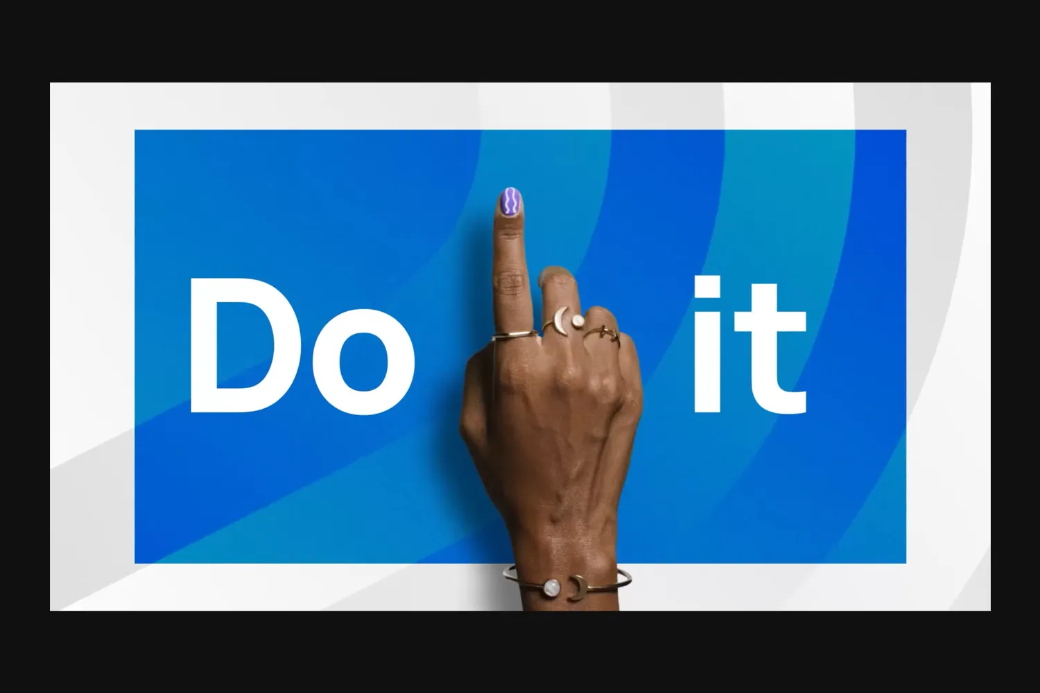
Making new gradients is especially useful when pairing a headline with imagery. This example uses a custom gradient for the headline that perfectly fits the image.
The colors have been made by sampling the image and then increasing the saturation and brightness. This makes the new gradient fit in with the existing color palette.
There are a few rules when making new colors:
Don’t overdo it! Try to stick to the approved color palette and only make new colors if necessary.

Don’t create a new gradient that’s too close to an existing one. If an existing color works, stick with that.

Keep it tone-on-tone. Don’t go from red to blue, go from bright red to medium red.
Keep the values in line with the existing gradients. Don’t go too saturated, muted, light or dark.
Core Color Principles
When designing a new layout, you have the choice between using a black or a white background. A white background looks clean, open and inviting. A black background evokes technology, elegance and power. Choose the one that makes the most sense for your project, message and intended target audience.
Whichever one you choose, use a highlight color to break up the layout, highlight certain information, guide the eye or emphasize a point.
When making layouts with multiple pages, don’t jump wildly from one color to the next. Structure your design into topics or chapters, and assign each its own color. Stick to that color within each chapter. This ensures consistency and prevents a cluttered look across the pages.

You can use colors for backgrounds, titles, icons, or any other elements where a touch of color is appropriate.
To maintain a clean and cohesive design, never mix different colors on the same page except where necessary for functional elements (like error messages or alerts).

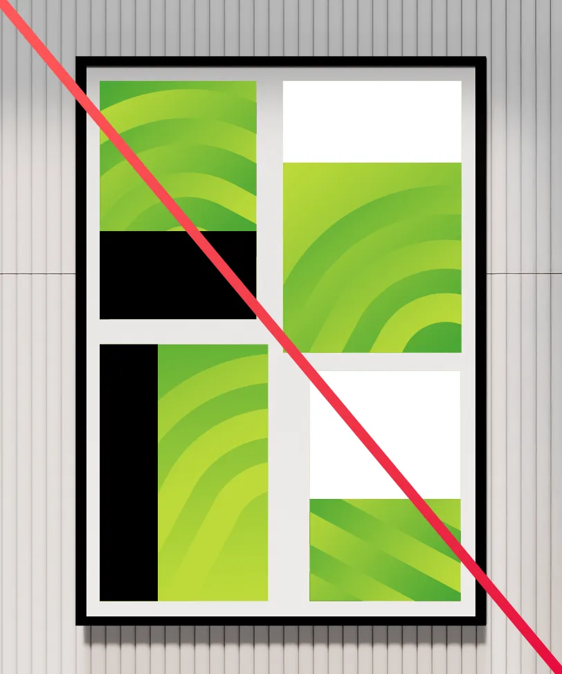
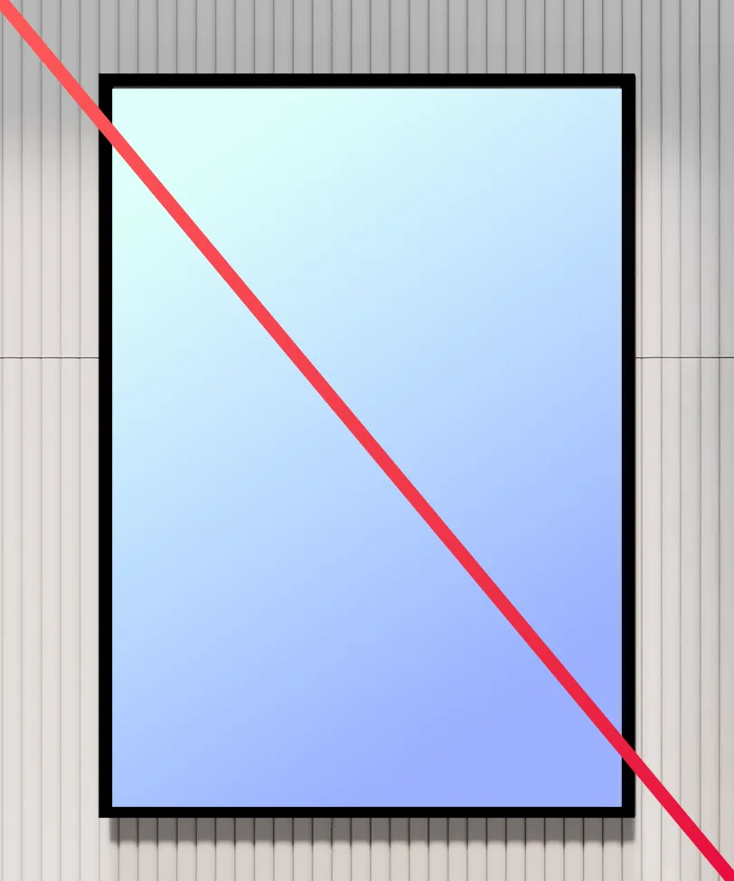
Don’ts
Please avoid the following mistakes.
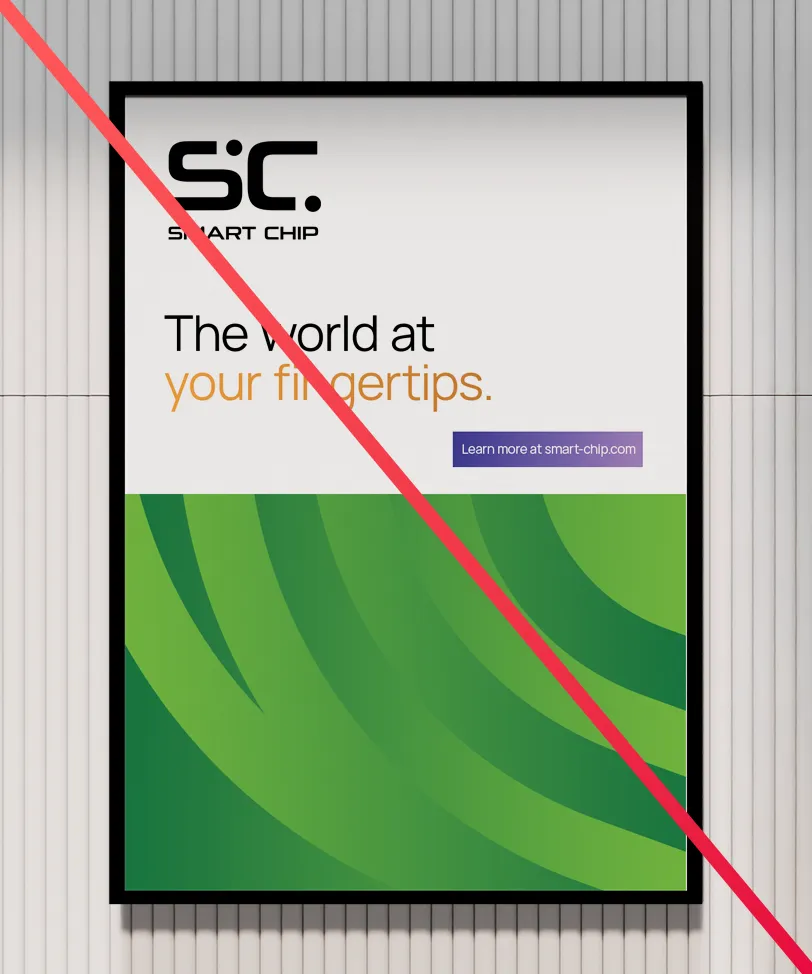
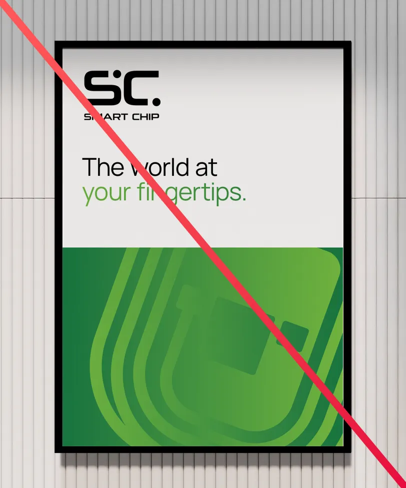
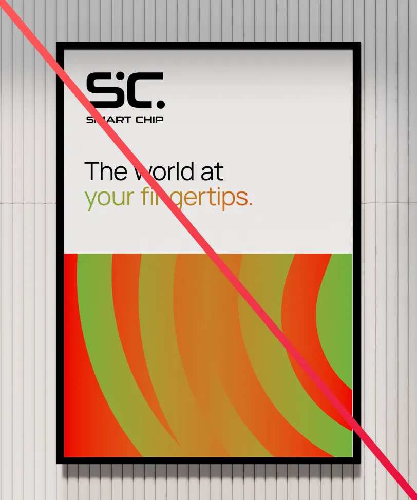
Don’t use different colors in the same layout.
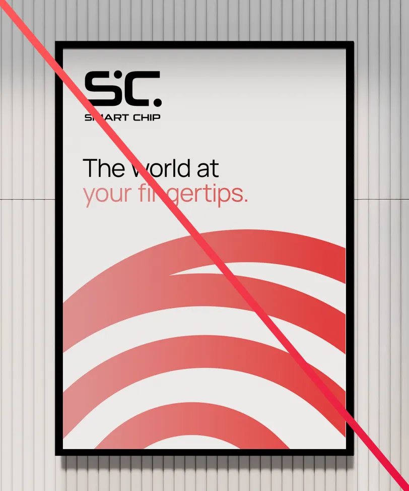
Don’t use the curves without a background.
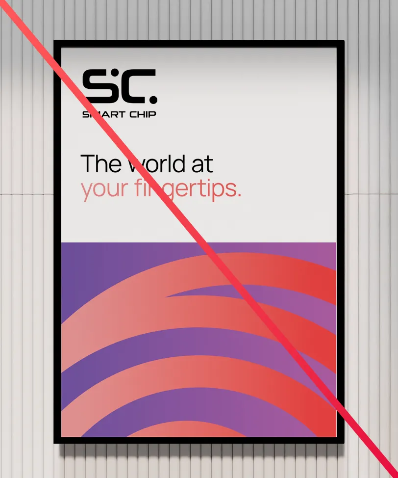
Don’t use the curves on a background with a different color.
Don’t show too much of the chip icon.
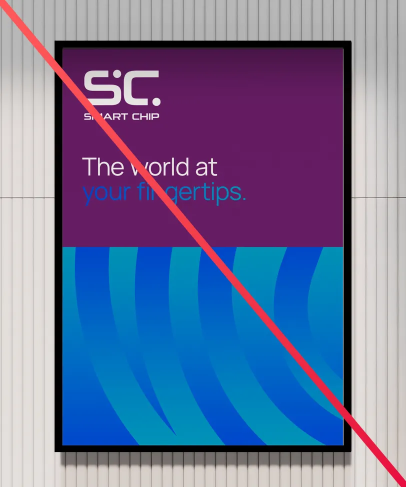
Don’t combine a gradient with a different color.
Don’t make new gradients that break the rules.
Don’t use colors for marks or whole text blocks.
Don’t use solid colors except where absolutely necessary.
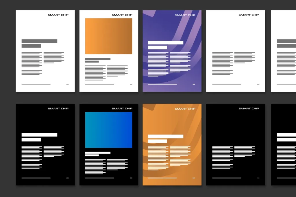
Examples
These are some examples of the usage of color and the curves. Note the differences in scale, crop factor, rotation and gradient range of the curves.