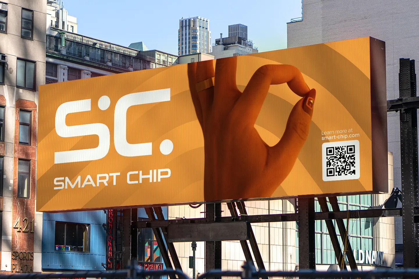
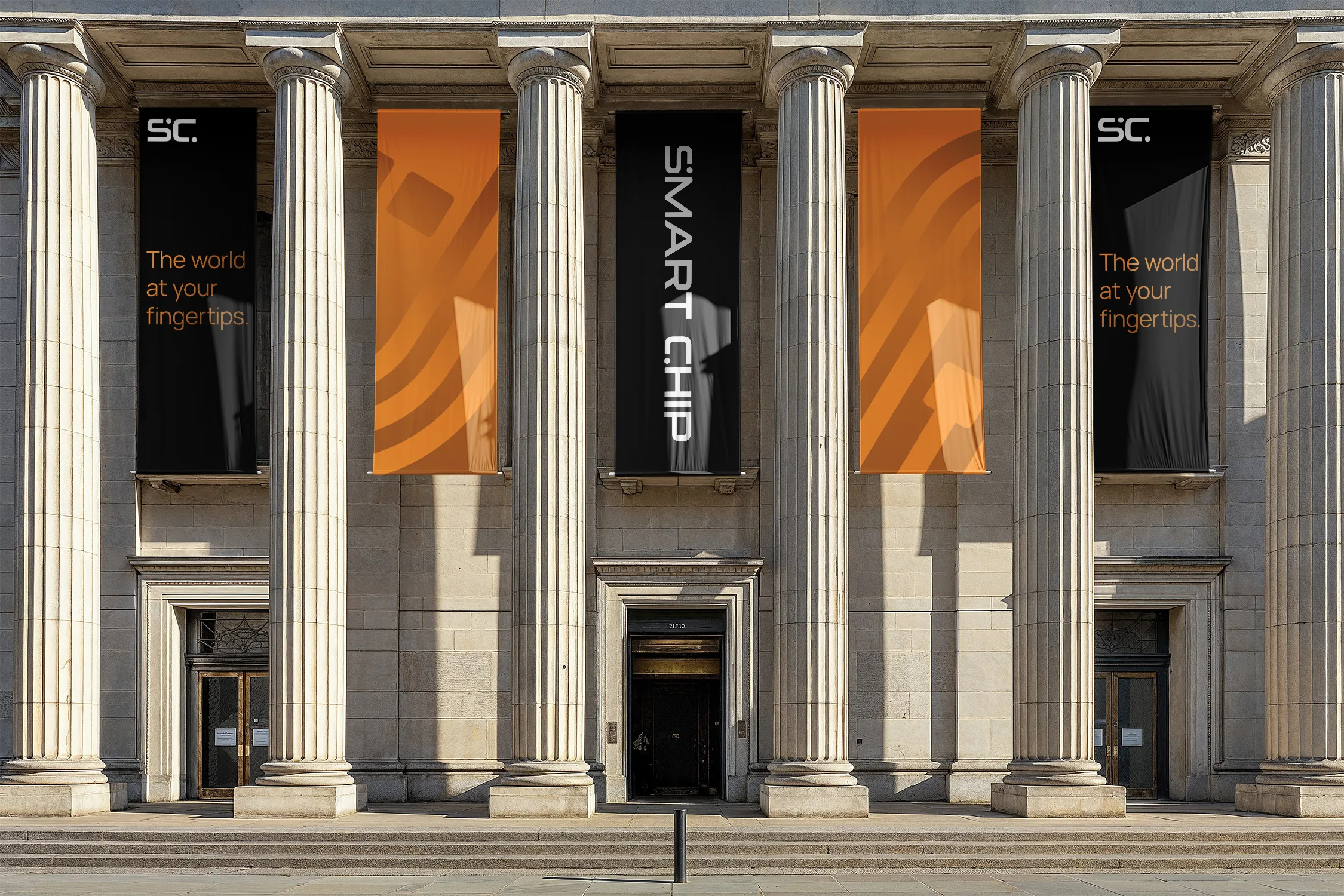
The Smart Chip marks – the Logo, the Icon and the Wordmark – all play a vital role in making the Smart Chip brand recognizable. Our branding is fluid, with a living color palette and changing imagery, which makes a strong and consistent use of the marks especially important.
Logo
The full logo, combining the Icon with the Wordmark.
Wordmark
For when you have to spell it out.
Icon
Simple and stylish.
Logo
The logo is the standard. It should be the first of our three marks that customers see (for example on the first page of a flyer).
If you’re unsure what to use, use the logo.

Safety margin
Keep a safety margin on all sides, corresponding to at least twice the diameter of the logo circles.
Note that this is the minimum; more is almost always better.
Color & Background
There are two versions of the logo; black and white. Use the one that provides the best readability and highest contrast for the given background.
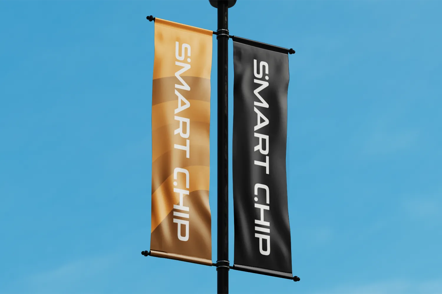
Wordmark
Use the wordmark in spaces where the logo would be too big or where its form factor would be awkward to place. Examples are narrow banners, pens or lanyards. You can place the wordmark horizontally or vertically.

Safety margin
The safety margin is the height of the wordmark on all sides.
Color & Background
The wordmark too is available in black and white. Choose the one that is most readable on the given background.
Icon
The icon is made for smaller formats where the full logo might be hard to read, like app icons or watermarks.
You can also use it in spots where the wordmark is already prominently present somewhere else, like the inside pages of a brochure.
Safety margin
The safety margin should be equivalent to at least the diameter of the circles.
Color & Background
Like the logo and the wordmark, use the icon in black or white depending on the background.
Don’ts
Please avoid the following mistakes.
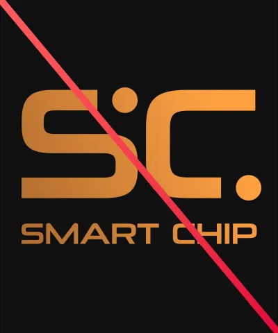
Don’t add color to the marks.

Don’t distort, stretch, bend or compress the marks in any way.
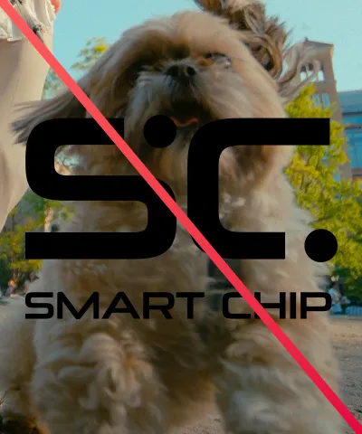
Don’t place the marks on backgrounds that make them hard to read.
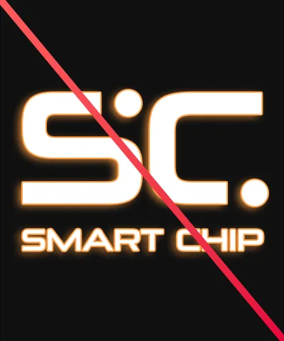
Don’t add effects like drop shadows or outlines.
