

Layouts
Smart Chip layouts use a simple but flexible grid system that keeps everything looking clean and consistent. At the same time, it gives you plenty of freedom to adapt to different sizes, form factors, and design needs.
Layout Styles
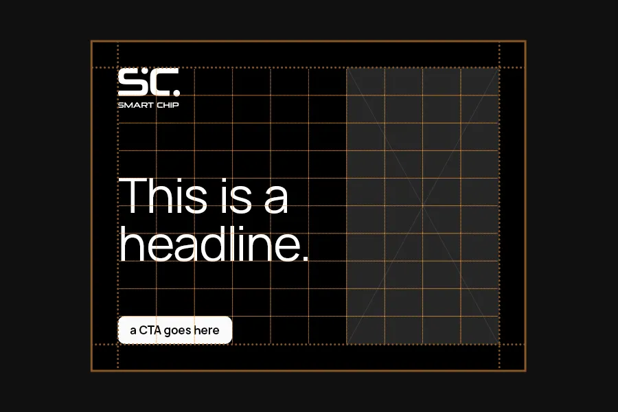
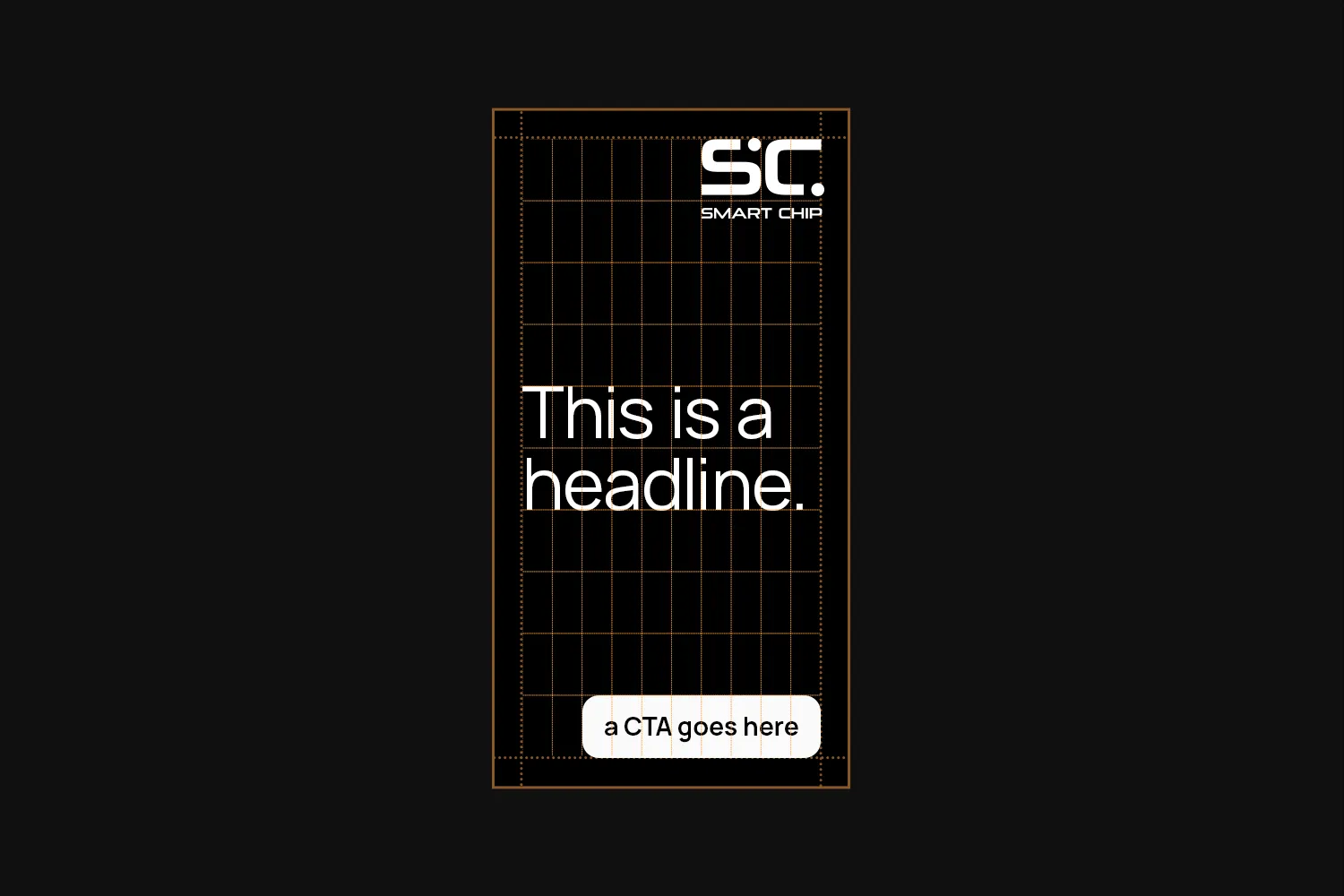
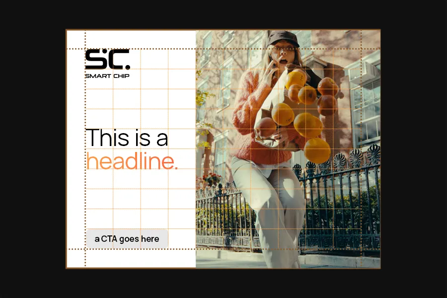
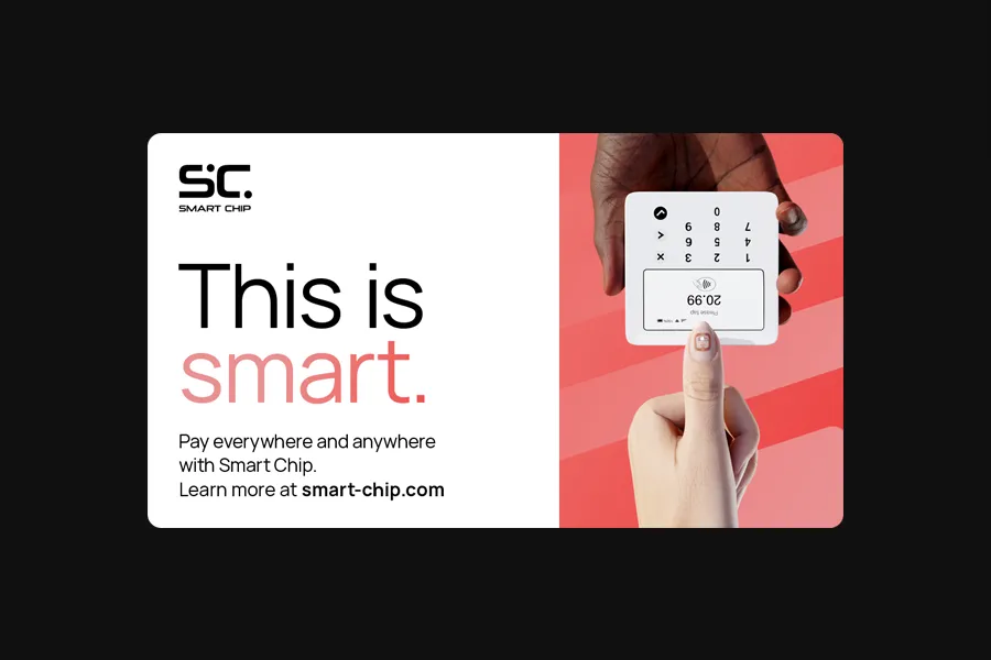
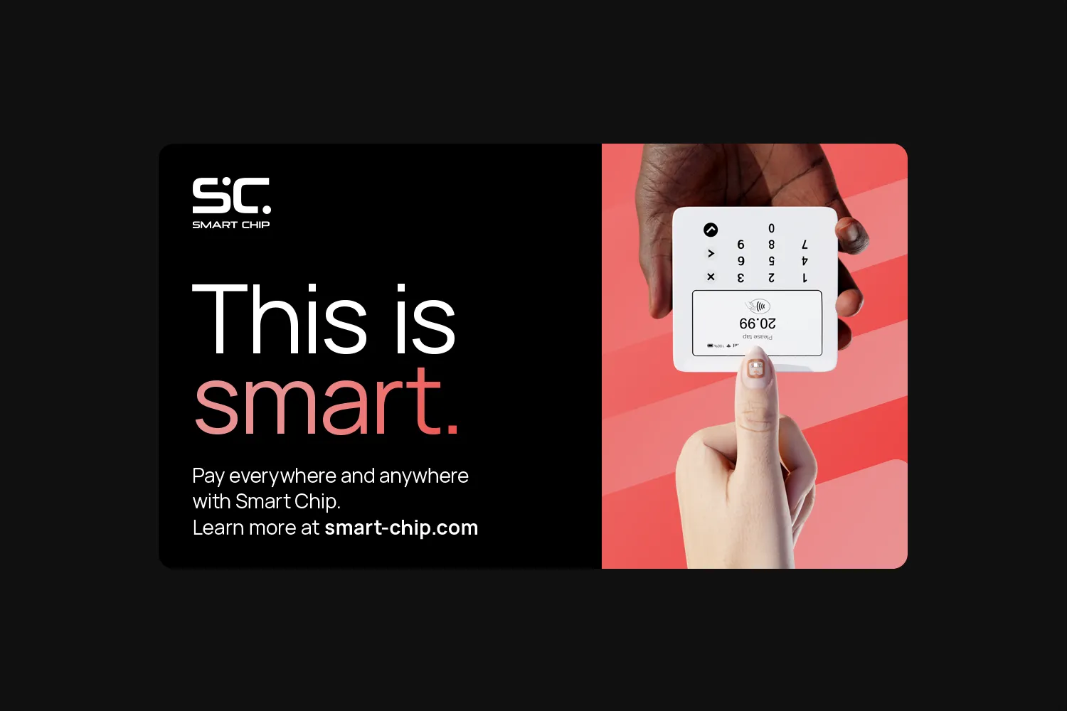
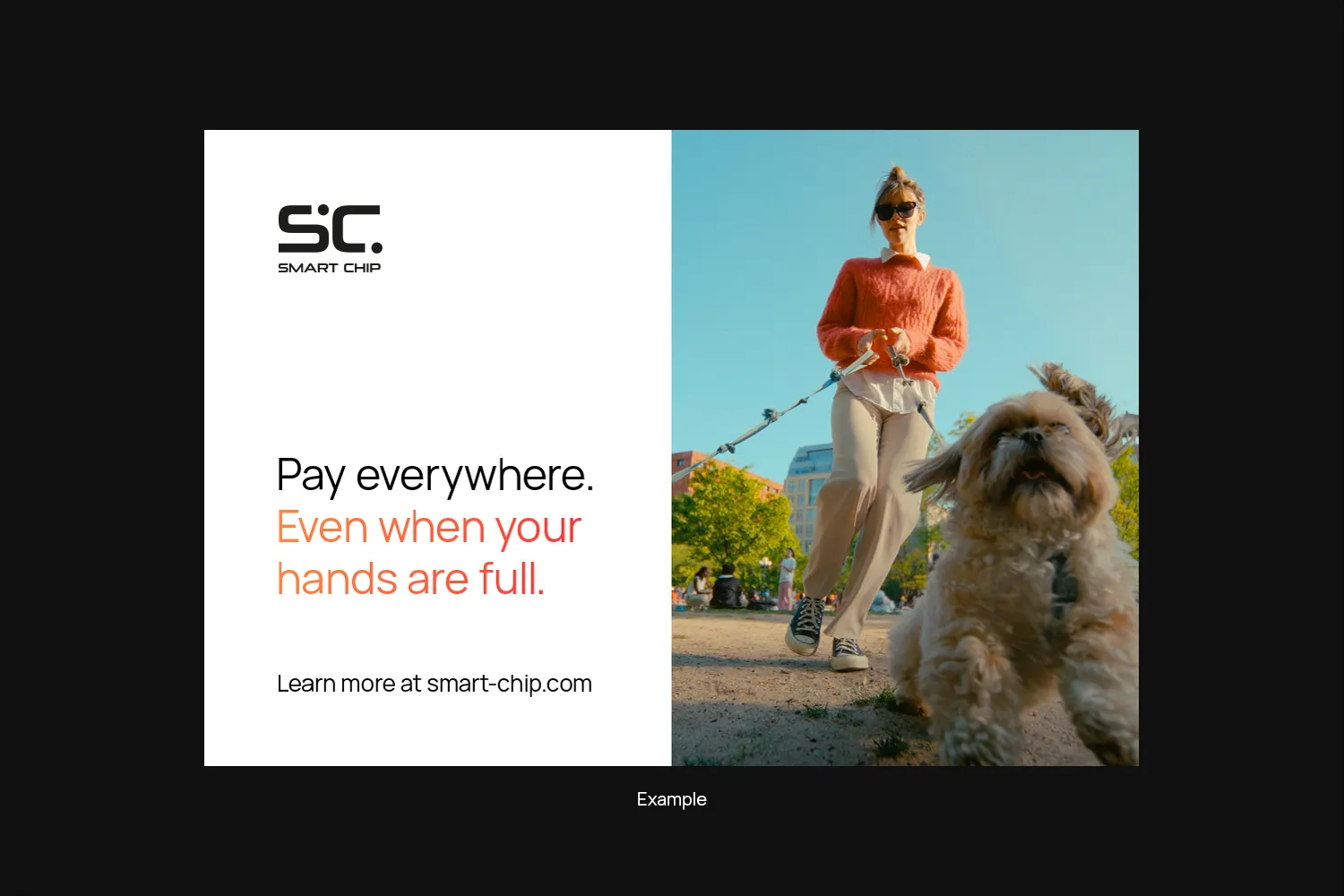
There are two styles of layouts: Full Bleed and White Space. Both use the same grid system and the same rules.
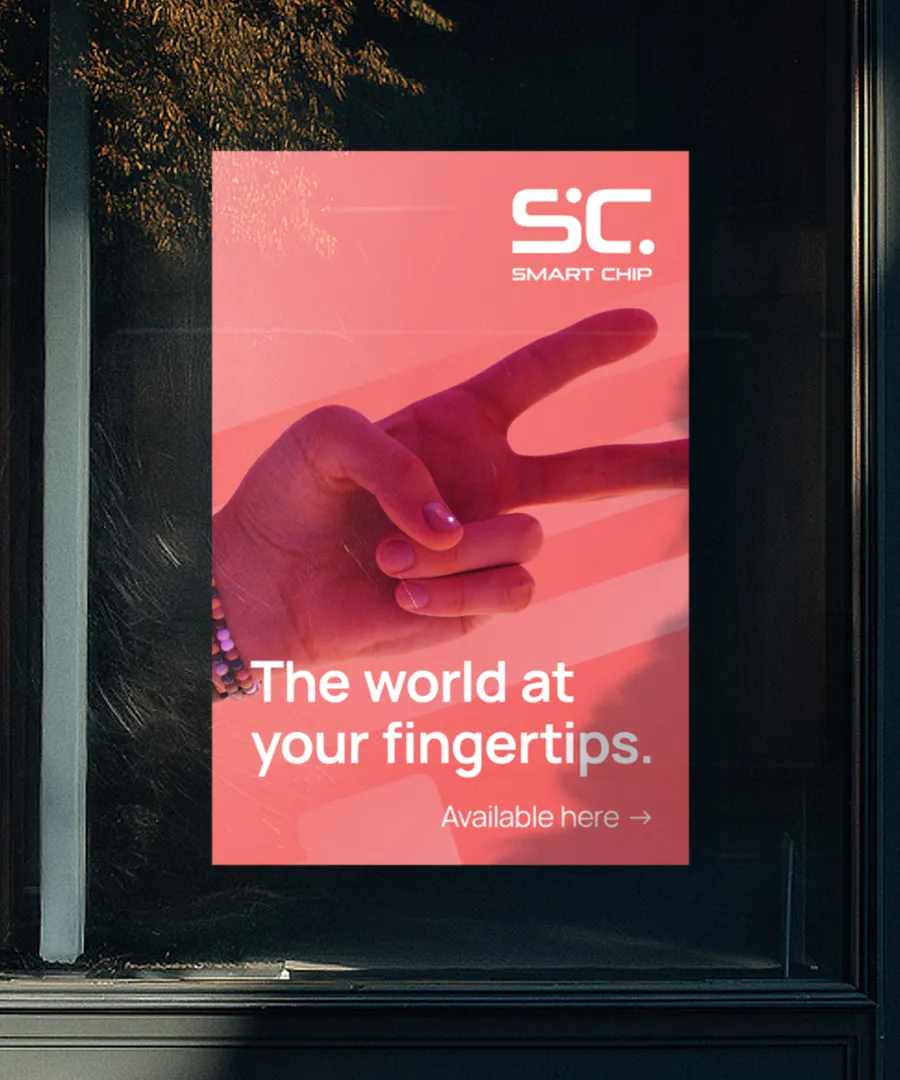
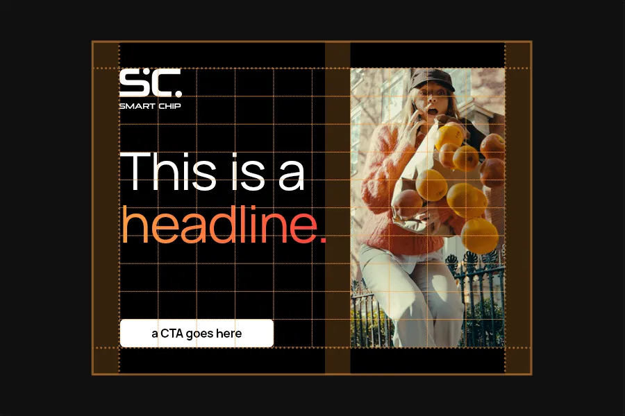
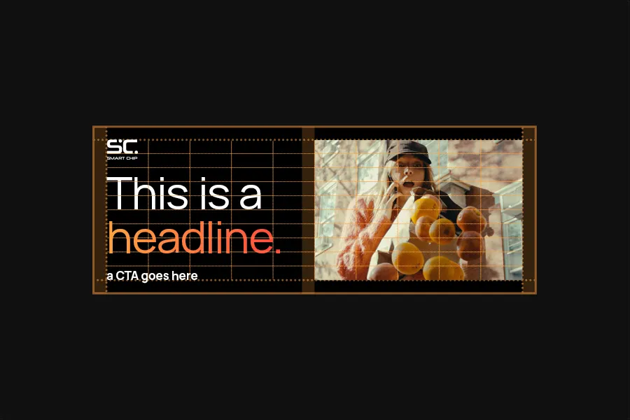
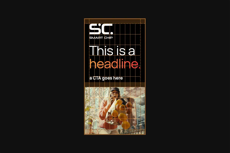
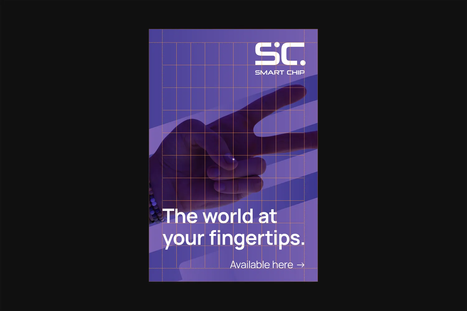
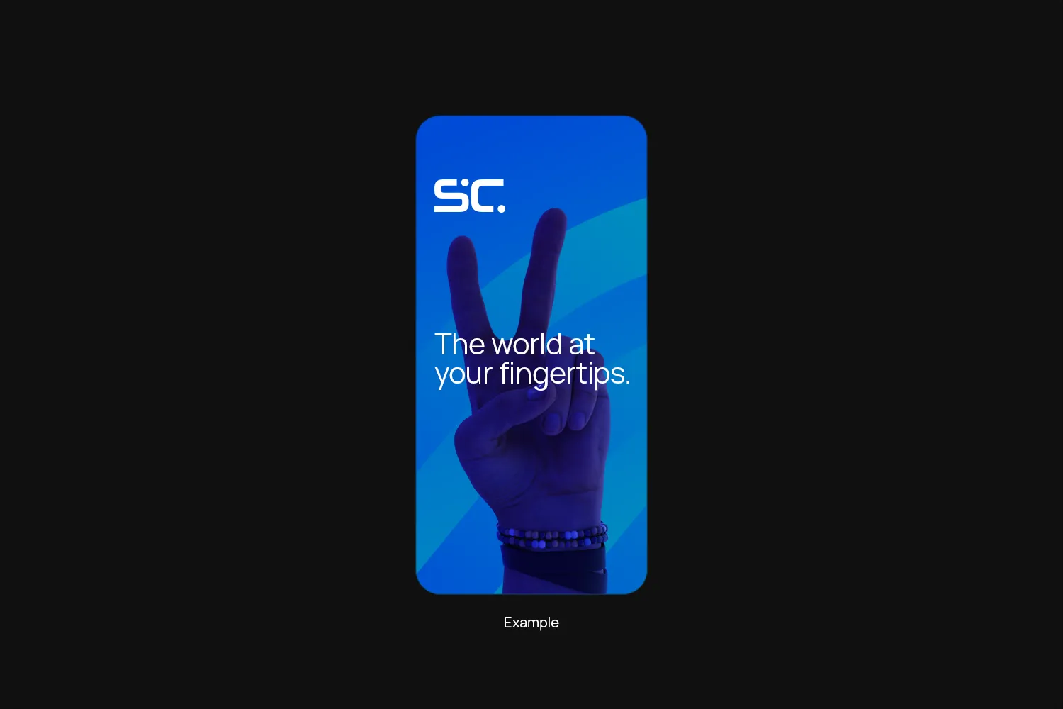
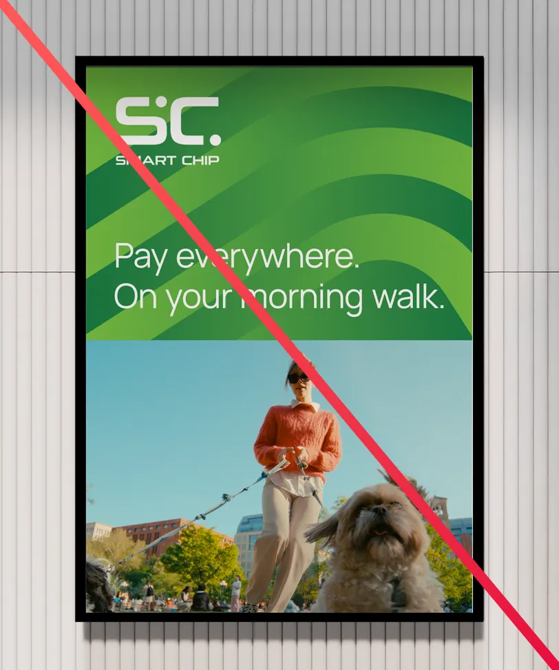
Full Bleed layouts use our color palette, bold imagery and big headlines to draw attention. They work best for signage or as an eye-catcher when paired with white space layouts.
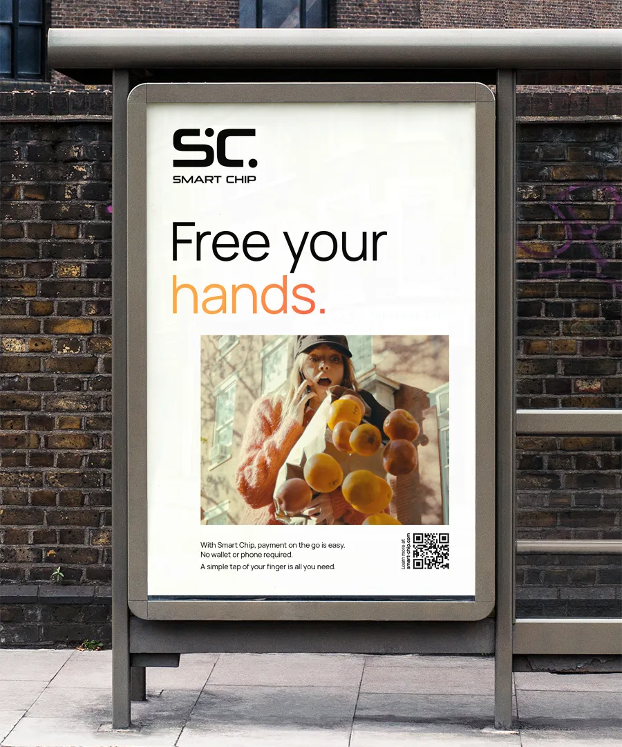
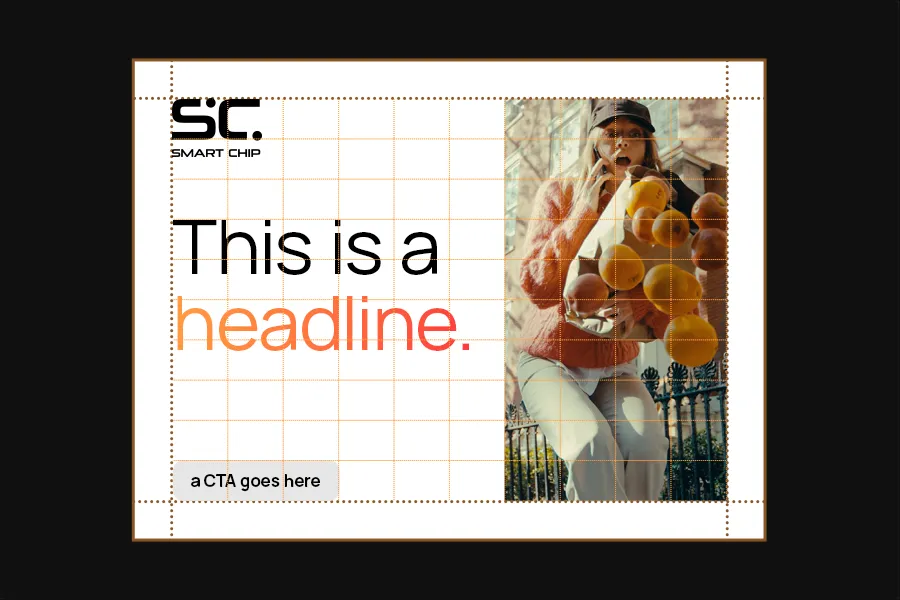
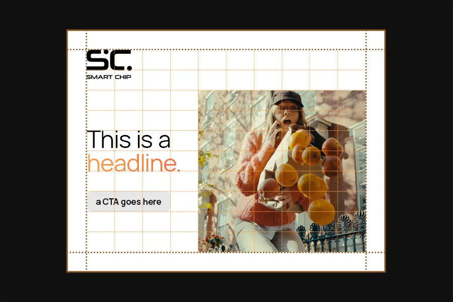
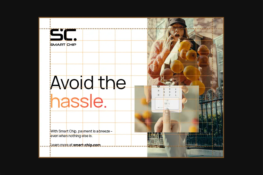
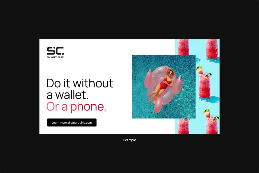
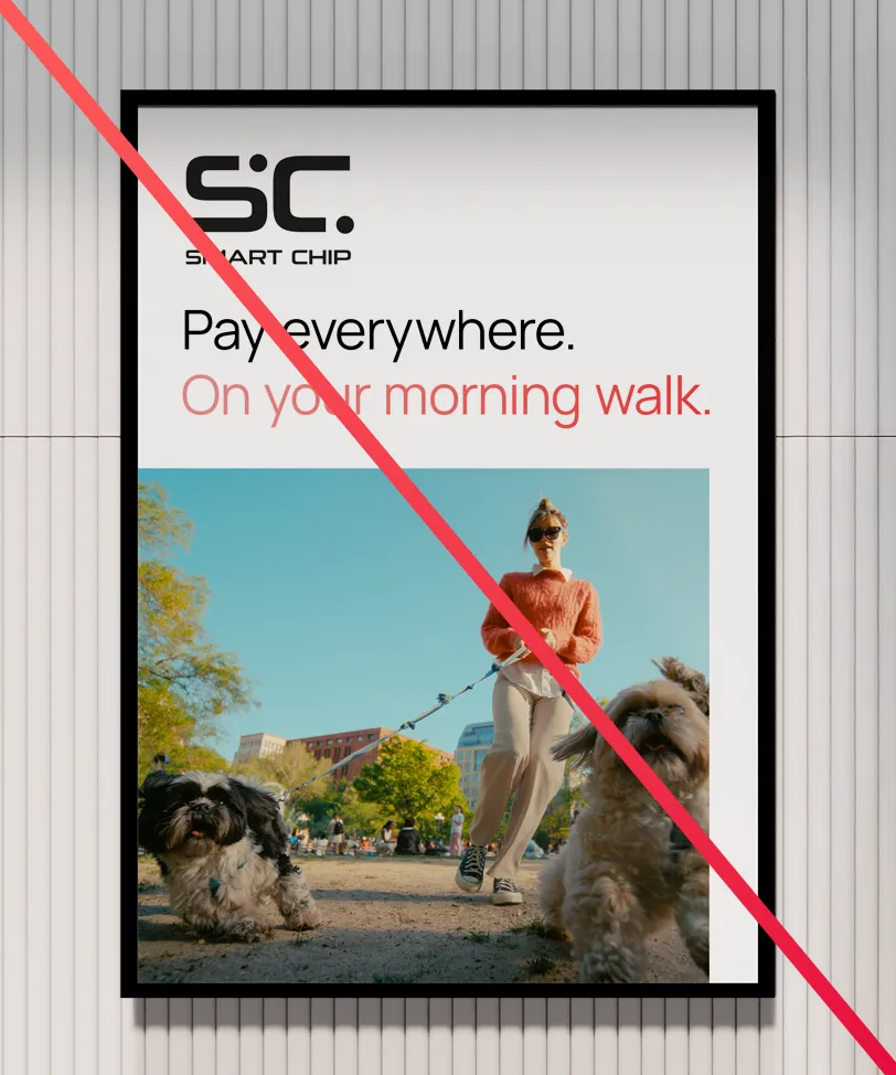
White Space layouts leave more space for text and can carry more information than a full bleed layout. This makes them more suitable to tell a story.
Grid Setup
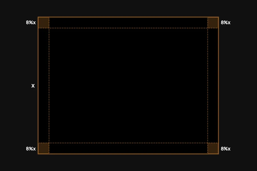
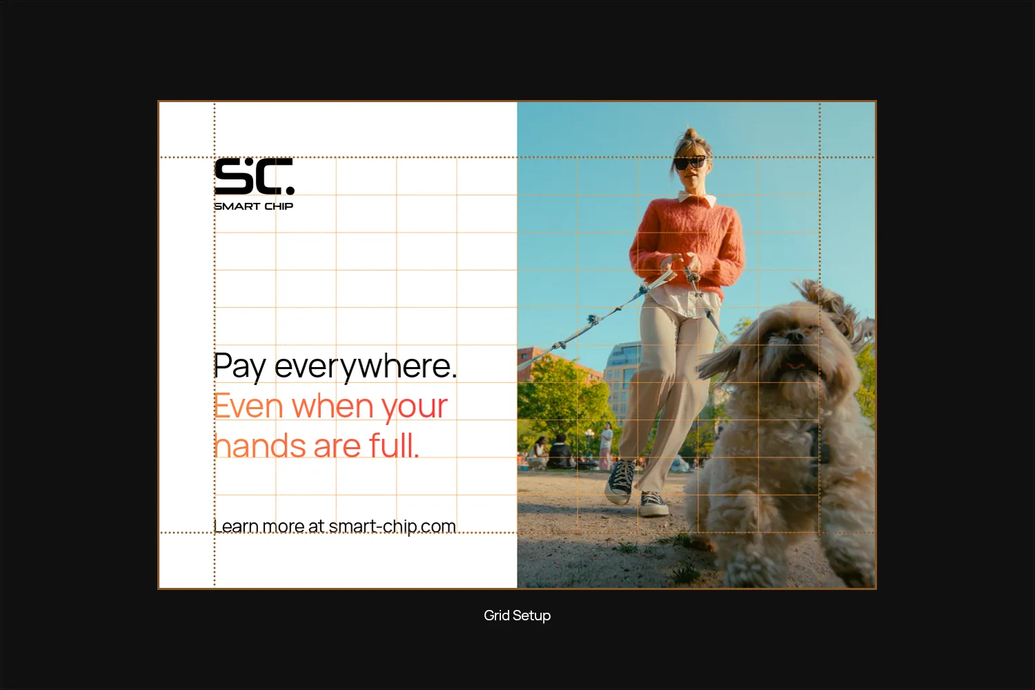
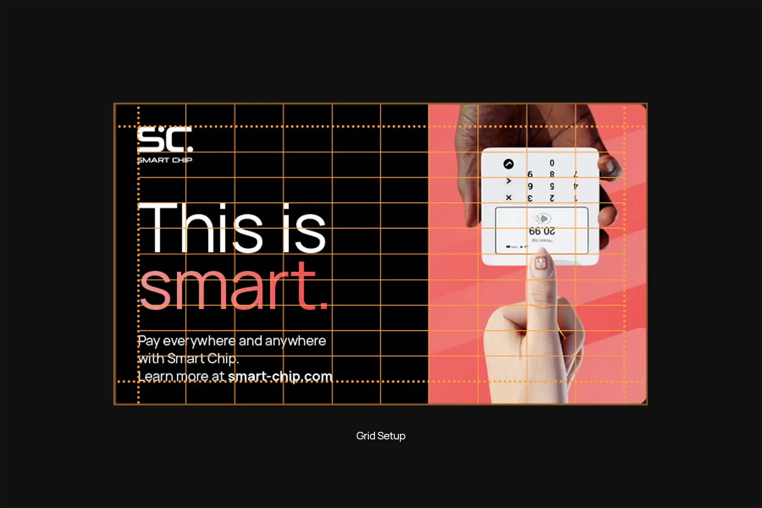
Start with the margins. The standard margin for layouts is 8% of the shortest side.
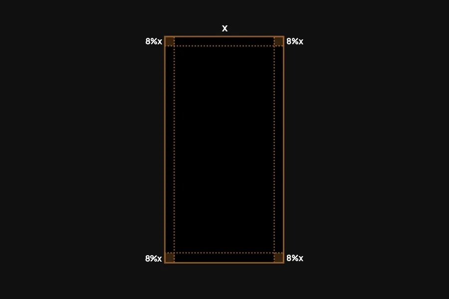
Divide the inner area into a 10×10 grid.
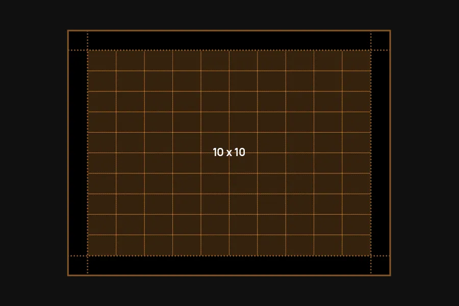
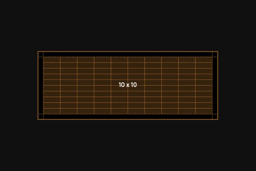
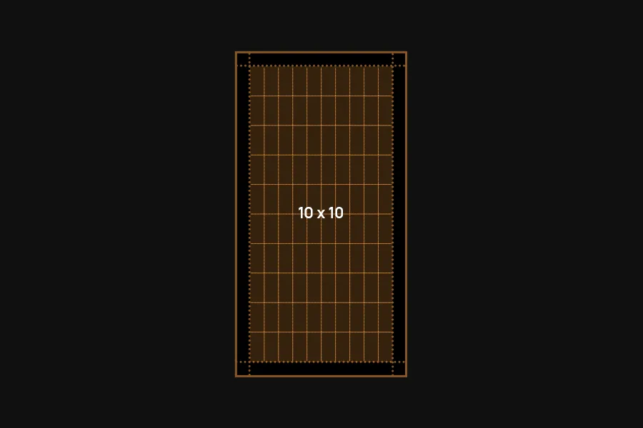
That’s it. This gives you the complete grid system. Use the grid lines to align and scale elements like the logo, headlines, CTAs, imagery and more.

Using the grid
Use the grid lines as a guide to align elements. The system is designed to be flexible, so feel free to mix and match sizes and arrangements to create a layout that works for your needs.
Headlines
Headlines can scale as big as they go to use the available space. They don’t have to – sometimes smaller is better. Give the design room to breathe.
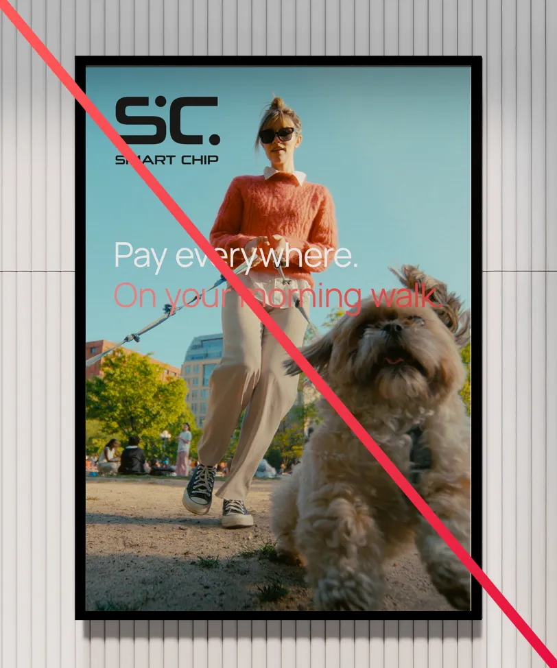
Keep a distance to imagery of at least the margin. Don’t overlay headlines over imagery, except in full-bleed layouts.
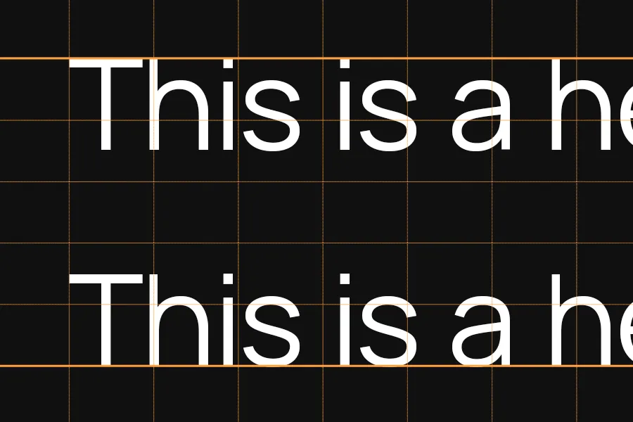
Text can either hang below a grid line or stand on one, whichever works better for your layout.
Imagery
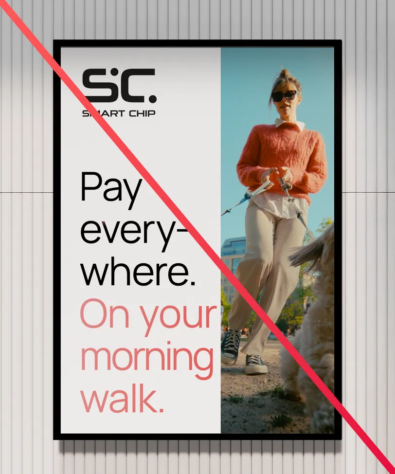
Align imagery with the grid lines as well. Images can stop at the margin for a clean, structured look or extend to the edge. For a more dynamic, immersive effect, they can also go full-bleed with text and elements layered on top.
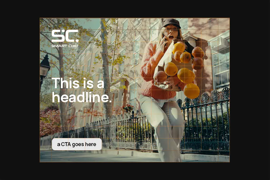
The background besides the image is either black or white. White is airy and free, while black is sleek and powerful. Choose the style that best suits the context and content.
When going full-bleed, make sure your text stays easy to read. You can go up a few font weights here if it helps with legibility. Also, don’t place text over key parts of the image (like faces) or over very busy areas.

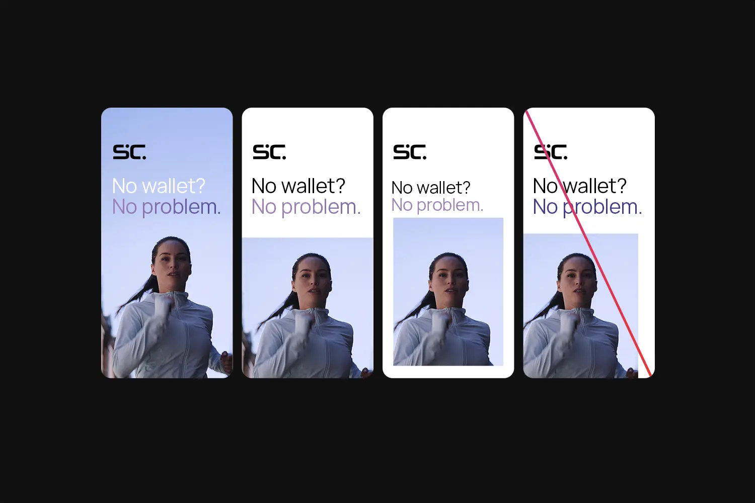
The bleed options for imagery are full bleed (extending on all sides), partial bleed (extending on three sides), or no bleed at all.
Avoid partial bleed on only one or two sides.
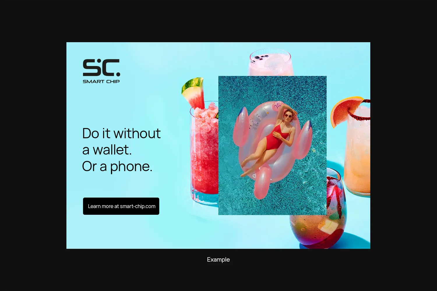
Picture-in-picture
Layering and overlapping images is a great way to share more info, add energy to the layout, and create visual depth.
Letting the overlayed images slightly break the grid makes them even more dynamic.
Marks
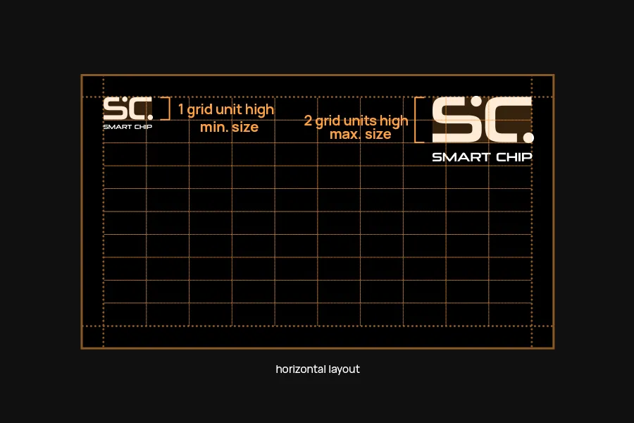
The mark (Logo or Icon) typically sits in the top left or top right corner, touching the margin.
The scaling is different for horizontal or vertical layouts:
- In horizontal layouts, scale the mark so the “SC” part is between one to two grid units high.
- In vertical layouts, scale it so it’s between two to four grid units wide.
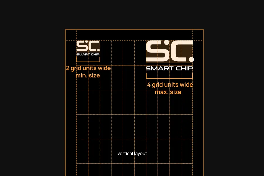
When positioning the mark, align it to the “SC” portion rather than the dots. The dots overlap the guidelines slightly.
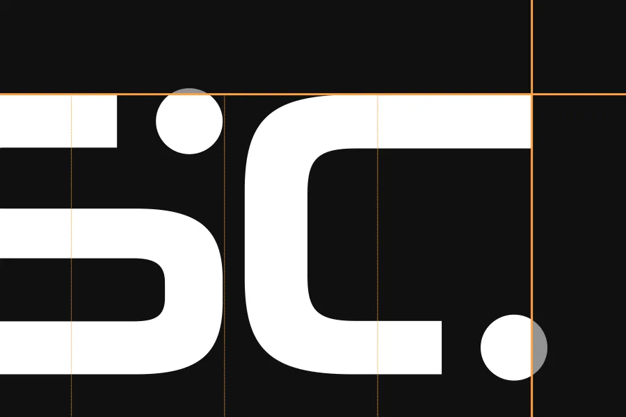
Only place the mark over imagery if it is still easily readable. Choose the version (black or white) that gives the best readability.
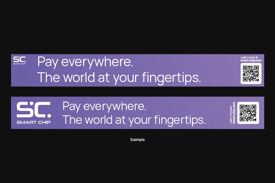
Examples


Exceptions
The grid system works well for most sizes. There are some special circumstances that demand a break from the grid though.
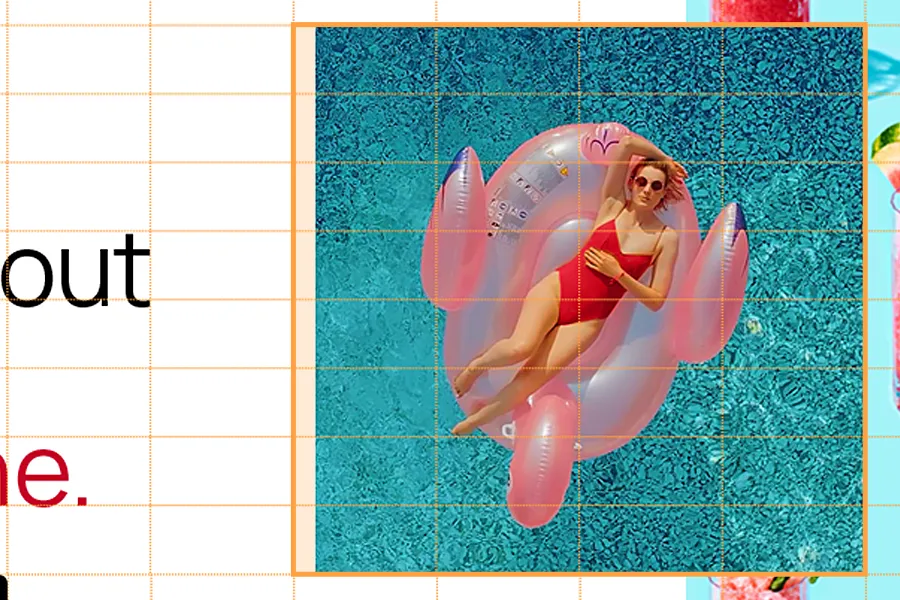
Square Images
The grid doesn’t allow for perfectly square images, but they look great in a lot of cases. It’s okay to bend the rules here – just make sure the image lines up with three grid lines.

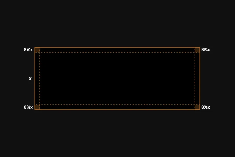
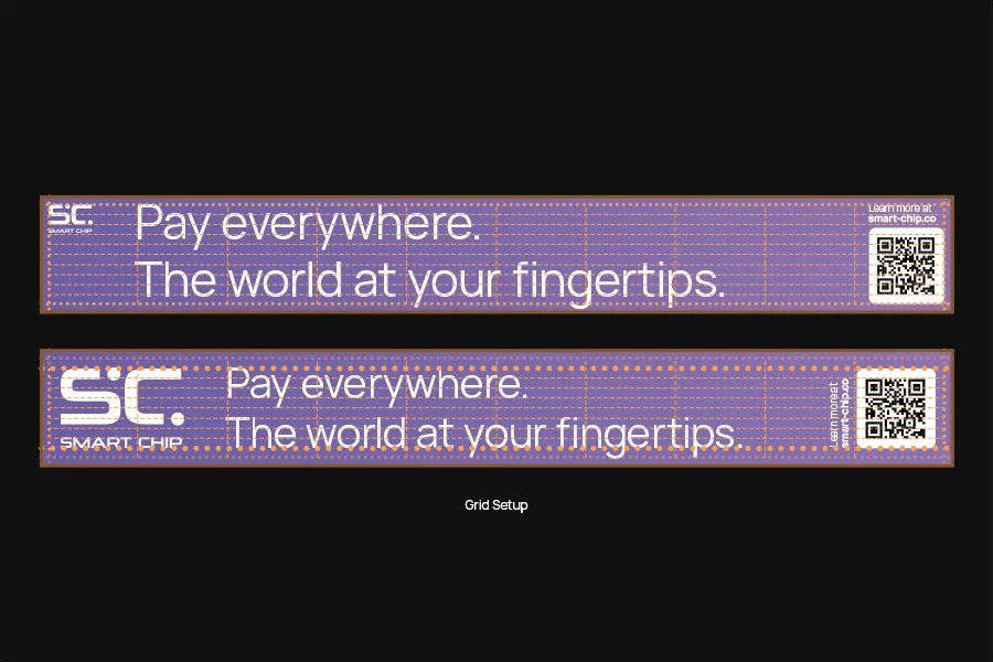
Ultra wide formats
In very wide formats, for example banners, following the grid lines results in a very small mark and a margin that is too tight (top example).
In these cases, we can use the first horizontal grid line as the new margin. Additionally, we can scale the mark so it takes up the whole height to the margin (bottom example).
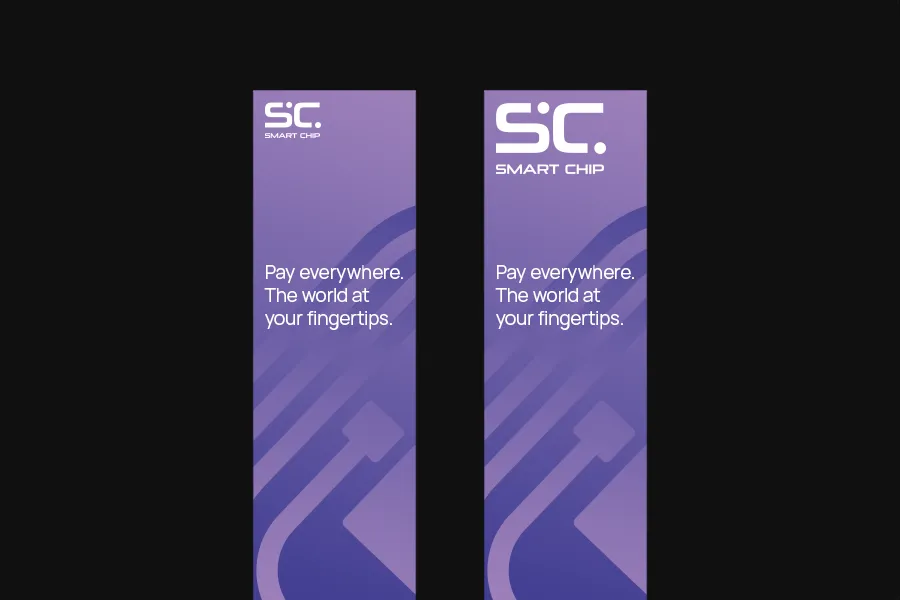
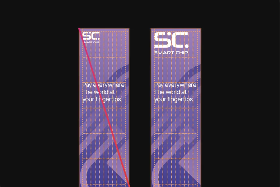
Very tall formats
The same is the case for very tall formats. In this example, scaling the mark to four grids would make it too small (left example). To get a more harmonic size for the mark, we can break the rule here and scale it up (right example).
Don’ts
Please avoid the following mistakes.
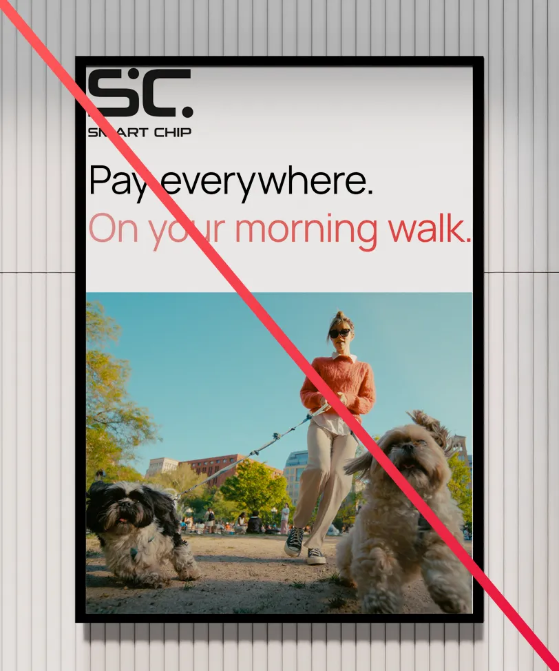
Don’t break the margins.
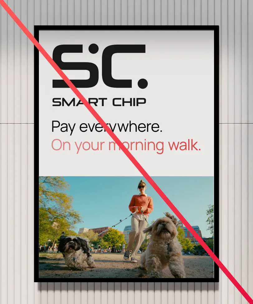
Don’t oversize the marks.
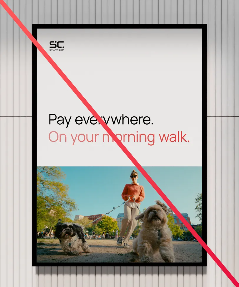
Don’t undersize the marks.
Don’t combine imagery with an unfitting color.
Don’t give imagery a margin on only one or two sides.

Don’t partially overlap text and imagery.
Don’t overlay text on imagery that makes it hard to read.
Don’t make text too tight.